 |
| So as I previously posted I got to the stage of adding the red paint to the image of Nick Cave I had drew. After I scanned in the image I noticed that it was a very open image and that it needed something just to tie it all in and that's when I decided a border would work really well. Borders are on trend right now and I think it works really well. |
 |
| My next step was to fill in some of the blank space around Nick Cave's portrait. I took the red splats that I previously made and put them into Photoshop. I used the background eraser to remove the white background so I was just left with the red paint splatter and copy and pasted the sections I wanted onto my poster. I positioned one behind his head which I think represents death quite well as it symbolises a gun shot and I also placed a little splat in the bottom left corner just to fill in space which looked wrong. |
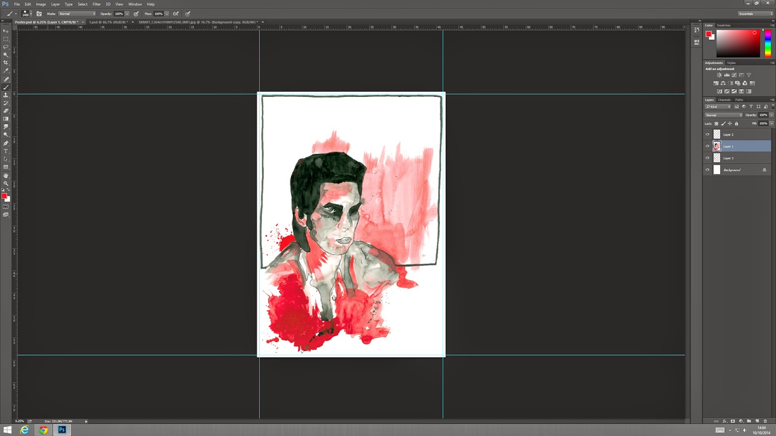 |
| Next I realised that the paint, when scanned in, looks pink so I messed around with hue / saturation to make the paint red. I think it worked really well and it looks so much better. I noticed as well that when I changed the colour I got more texture in the paint which I really like because I think a block colour would have looked too simple and I think the texture adds to my concept of murder as it's really all about aggression and anger. |
 |
| The next stage was to create a title for the poster. My poster is basically advertising the album 'Murder Ballads' as if it was a new release or something. I was going to try creating my own font but I am not good at typography so I thought I would take a different route and use newspaper. This type of text was used quite frequently in the punk era and even though this album is categorised as alternative rock I still think this type face works well with the style of poster I have created and because the title has a ransom style that also ties in with my concept of Murder. To create this I basically bought a newspaper and cut out the letters to make 'Nick Cave', scanned them in a positioned them how I thought it looked good and then changed the layer to greyscale. I changed it to greyscale because there were a mixture of colours in the title such as reds and yellows and I just think it looks better considering there is so much colour and action in the drawing. |
 |
| My next hurdle was choosing a type face for the other text on the poster. As I said before I am not good at typography so I chose to just go with a general font from Photoshop. I wanted a simple type face with a thin line and more spacing in between the letters than usual. There isn't any reasoning behind this I just think it would look much neater and crisp if it's easy to read and more people will be drawn to it if they can see clearly. I found 3 type faces that I liked the look of, this top one is called Courier New Regular. |
 |
| This type face is Geniso Regular. |
 |
| This type face is Letter Gothic Std Medium. I chose to go with the Geniso Regular because the line is nice and think, how I wanted it and I just really like it. The first one was too typewriter like and I think I just preferred the second one. |
 |
| This is where I decided to position the text. The text says '& The Bad Seeds' and I placed it under Nick Caves name as I thought it would fit well and I didn't want to isolate the text from the rest of the poster. I tried out different positions but I think this looked best. |
 |
| I then decided that the bottom right corner was really bare so I needed to add something. I thought about adding more red splats but I think if I added more red it would be over powering and it would be way too much for the eyes. This is when I decided to use the black splats i created with ink. I did the same as with the red paint and removed the background so it as transparent and found a cool splat shape to place in the corner. I tried it right in the bottom corner but I think it looked better when it overlaps the red and Nick Cave's shoulder. |
 |
| When I looked at the red background of Nick Cave I thought it was a bit bare so I thought I would add another image from my development into the poster. I chose one of the red hand prints I made and placed it onto the red painted background and changed the opacity of it so it wasn't too over powering. As is have previously mentioned I created the hand to look like a bloody hand has been rubbed onto something, like a bed sheet or something similar. I really like how this looks, I think it just adds a little something to the image and it's not in your face, it's subtly there in the background and I think it works really well. |
 |
| it is hard to see the change in this image but I have selected the line of the border and changed the levels to make it darker. Before it was kind of a dark grey when I scanned it in so I just made it black basically. I think it looks so much better now that it is bolder and more like a border. |
 |
| I have done 2 things in this image. I have selected the hair and the eyes and used a back soft brush to make the areas darker as I didn't like the dark grey colour as I thought it made the image look washed out and rushed. I think it looks so much better now. I also added more text to the poster, using the same type face as before I wrote 'Murder Ballads' on the space where the hand print is. I really like the placement of this text and I think I have used the space I have really well.
Over all I think my poster has turned out really well, I think it fits my target market of older teens to adults and I think it portrays my concept well also. When I print this it needs to be A2 in size and I have also added the 5mm bleed around the poster which is required on all final illustrations. I also have to submit this in a digital form which has to be 400 x 400px and 72dpi.
Final Poster  |
No comments:
Post a Comment