Monday 27 October 2014

Non - Narrative Illustration - Postcard Packaging

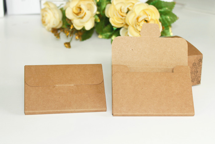
Before I made my packaging for my postcards I looked at styles of packaging that already exists. I found lots of different interpretations of packaging and I really like the styles below. The first one looks to me like the cards are wrapped in tissue paper and then there is a paper wrap around the that to keep it together. I really like this one because it is very simple to make and it does it's job really well. Also, I find it very aesthetically pleasing. The second one is kind of a box that folds up. I think this would be cool if there were magnets inside the tabs and that's how the box stays shut. I also really like the pattern on this. The last one is more like an envelope with a tab which tucks into a slit and that's how it stays together. I like the paper material of this one, I think the brown works really well.  

Because the images on my postcards are rather loud I thought that going for a more simplistic packaging design would be the best direction. I took an A4 sheet of layout paper (tracing paper) and folded in all of the edges around the stack of postcards. I then stuck the paper down with some tape, just to note if I was producing these to sell I would use tape which is pretty much transparent and that peels off easy with no rips. I then printed out the title "Murder Ballads" onto an A3 sheet of cartridge paper and then cut out the title in a strip of paper that would wrap around the postcards, I also secured this together with a bit of tape. I really like how this looks, I think the layout paper works well because you can see the images through the paper and I also think the wrap around looks very professional. I didn't put any images on the packaging for the simple fact that my postcard images are really strong, in my opinion, and I didn't want to over power it. Some times less is more. I have created this in a landscape format but I could just as easily make a portrait format too. I believe this would be a really cheap and effective way of packaging my postcards as not much ink was used in the process and the paper I used was less than £1 in total. 


Non - Narrative Illustration - Vinyl Back Cover / Change

Last Friday we had another group crit and my work seemed to be getting some really positive feedback which was really nice because I feel like I've worked hard on making my work better since the last crit. Unfortunately there was one little thing that I did that was misleading. In the song Song of Joy it says that the murderer quotes John Milton in his victims blood and the quote in the song was his Red Right Hand and I thought that writing this on the back of the vinyl would be a cool idea but it turns out that His Red Right Hand is actually another song by Nick Cave and The Bad Seeds from a different album so there vinyl cover I designed would then be misleading to other people. What I decided to do instead was keep the little red hand at the bottom because I think it fits well and it fits well and I am also going to add the track listing to it. I will show the screenshots below but what I did was just wrote out the track listing in my sketchbook using a Molotow Acrylic Paint pen and then I scanned it in, changed the levels so the text as darker and then positioned it where I wanted it. I positioned the text central because the red hand is in the centre of the bottom and I just think it looks better than if it was at the side etc. I have printed out my vinyl cover again as I changed it and I printed it on A1 paper at 12" by 24" with a 5mm bleed all the way around and a 2cm glue tab area to stick it together. (last image)


Wednesday 22 October 2014

Non - Narrative Illustration - Product / Postcard

After looking at already existing Nick Cave products I found that postcards had been produced. I really liked the idea of using my existing images that I have used for my poster and vinyl etc. on postcards which people could collect. I will show below some postcards that already exist from Nick Cave merchandise.


I used Photoshop to design my postcards by taking bits and bobs from my drawings I have already drawn. I decided to use these drawings because people tend to collect products that are based around a certain album etc. therefore I think this is good marketing. I kept the border on all of the postcards just to keep the same style running through the project.

Here are my finished images. They are A6 in size (general size for a postcard) and if I ever wanted to print a lot of them, an A1 sheet can print 32 postcards so I think it will be rather cheap to make. The postcards I made were printed onto glossy paper and I cut them down to size using a craft knife. 


Non - Narrative Illustration - Product / Drinks cup

I have now started to think about the products I would like to design / make in the project and as blood has played a bit part in my assignment I had the idea of making a drinks cup with the liquid inside but make the liquid look like blood. I thought about this for a while and realised that the market for this type of product is usually young children, which created a problem. As my target market is older teens and adults I decided to design a freeze cup / glass. This is where the liquid in the gap of the cup freezes when put into a freezer and it keeps your drink cold. I thought this would be an effective idea because I could use a cup in the style of a beer jug (you will see in my images below) which will be aesthetically accurate for my market. I am not promoting this as an alcoholic glass as there will be people below 18 and 21 who this is aimed at, I just think the style fits really well and with my product being called a freeze cup I doubt anyone would get the wrong impression. 


The images below are just little mock ups of what the freeze cups would look like. I have put 'Nick Cave' around the top, it will go all the way around, using my font I did for the Vinyl sleeve. As I used a template of a freeze cup for these images I selected some of the iced parts and coloured them a dark red to resemble blood, I think this would be an awesome idea and I really think people will buy these. 

The first image is without the red and the second is when I added it in on Photoshop. I really like this idea and I think it would be really successful.


Non - Narrative Illustration - Product Research

Last week I posted a process picture of my Nick Cave drawings on Instagram and I realised that the official Baker Skateboards account liked my photo. When people like my images on Instgram I always check out their profile and I though it was awesome that a well known company had liked my image, but it was even more awesome that one of the members had designed a Nick Cave Skateboard and there were images of Nick Cave with the deck itself (screenshots below). I never even thought of having a skateboard as a product but I think the idea could be really cool. I am thinking of maybe going down this route, if this idea has already been produced then I see no way that this can fail. 

http://shop.bakerskateboards.com/collections/all-boards/products/reynolds-nick-cave-8-25-deck

http://bakerboysdist.com/

http://shop.bakerskateboards.com/collections/all-boards/products/reynolds-nick-cave-8-25-deck


Tuesday 21 October 2014

Non - Narrative Illustration - Vinyl Sleeve Printed!

After I developed my Vinyl cover I went onto a Mac (as I have been working on a PC) and checked the colour of my images. I changed the red shades a little using hue / saturation in Photoshop just until the colour was perfect. I then wanted to get the vinyl printed so I could make it. I used Photoshop to create a 24" x 12" canvas for the two sides and then added a 5mm bleed and an extra 2cm tab on two sides of the front of the cover, these are the glue tabs. 

As the big printer in the uni is broken at the moment I went to a shop to get my vinyl cover printed. I was a little disappointed as I expected them to print onto cartridge paper as I was paying £5 but instead they printed it onto normal printer paper. I made the best of this situation by mounting the sheet onto A1 cartridge paper which I bought from the Art Box. I spray mounted this on and then cut out the vinyl using a craft knife. I then used glue on the tabs and glued the vinyl together. 

The presentation of my Vinyl isn't too bad in my opinion, I made a few little slip ups with the cutting but as this is just a mock up it doesn't really matter. Overall though I am really pleased with it, the layout works well and I got the measurements correct which I was worried about as I get really confused with the scaling system on Photoshop. 

Below you can see a few images of my finished Vinyl, the front, the back and an image showing the record fits into the case. I will be making an inlay for my vinyl but I am going to wait for the printer to be fixed at uni so I don't pay a lot of money for a bad print.


Monday 20 October 2014

Non - Narrative Illustration - Vinyl Development / Front and Back

After I developed my poster and finally found a stage where I really liked the product I moved on to my vinyl. 


 Firstly I copied the red section from the poster a pasted it onto the vinyl cover. I edited parts that weren't quite right until it was right. 
 I then chose the font I created which looked best. I really like the positioning of this. I decided against the strike through with this font as it doesn't work but I went along with the text going outside of the border.
I then chose the text for the rest of it, ''and The Bad Seeds' and 'Murder Ballads' and I really like the positioning for these. I think the spacing is good and I don't need anything in the middle to make everything tie together. After this I changed the hue / saturation of the red and the finished product can be seen at the end of this post.
 For the back of the vinyl I wanted to write "His red right hand" on the back in red (blood) because in Song of Joy it states that the Murderer writes quotes from John Milton in blood after he kills his victims. I added the border I have used throughout my drawings first.
 I chose the text I liked most which I designed and positioned it rather big on the back. I really like the size and positioning because it looks like someone has wrote it on a wall or something similar.
 I changed the hue / saturation of the text so it looked more blood like and once I was happy with the colour I re-positioned it because I had a really good idea.
 At the start of the project I did some bloody hand smudges. I didn't realise at first but this ties in really well with the quote I have written on the back of the vinyl. I changed the hue / saturation of the hand and placed in the middle of the bottom of the text and I really like how it has turned out. The size of the vinyl is 12" and has a 5mm bleed.

Non - Narrative Illustration - Poster Development

As I decided not to use real blood as I thought it would be a little distasteful, the fact I couldn't buy it from anywhere and for health and safety reasons, I made an alternative. I mixed together flour, golden syrup, red food colouring, water and Brilliant Red Brusho and it made a horrible consistency but when I used it t worked really well.


I used the poster I originally drew and went over the red with the fake blood I made. This scan has changed the colours of the image once again so the blood looks very pink but I can edit this to look better and more like blood.


 I went through the process of creating my poster again, adding all of the little bits and bobs like the blood splatter and the black splat.
 This is where I added the text. I used one of the fonts I created and used 'Murder Ballads' on the top of the poster. I changed the colour from red to black using the levels tool and I really like how it has turned out. Below you can see the final poster. I changed the hue / saturation of the red section and I think it looks so much more like blood now, the texture I have gotten is also really effective. The size of the poster will be A2 printed and the digital version is 400px x 400px at 72dpi both ith a 5mm bleed.


Non - Narrative Illustration - Type Face

For my poster I did pretty much the exact same thing with my poster as I did with my vinyl cover. I tried a few different type faces but they just didn't work, for the same reasons as the vinyl the type faces below didn't fit with the style of the poster and some of the text would be hard to see.


Since the beginning of the project I have been worried about typography, I didn't want to download any type faces from the internet for copyright purposes, I also didn't like the idea of using already existing type faces from Photoshop and I am not great at creating my own fonts, my handwriting isn't the best and I was very skeptical to try it. But in the end I decided I would give it a go because obviously I don't know until I try. The images below are what I wrote into my sketchbook, I didn't do anything fancy I basically just wrote in a way I thought would look good. Some are better than other but I really like most of them. At the beginning of the project I wanted to stay away from 'horror' styled type faces just because I thought it was a bit obvious but I tried to make the typography a little more aggressive rather than stick to very straight edged lettering. 

I wrote in red pen at first but I will more than likely change it to black on my images, you will find out in my next few posts. ('His Red Right Hand' will be explained in a later post)


Non - Narrative Illustration - Group Crit / Feedback / Development

In a recent group crit with some fellow class mates and my tutor I got some really good feedback on my work and I feel happier now to move on and develop my ideas a little further. I was again told that I need to work on my type face on my poster and vinyl cover and because my concept is Murder I was told that using real blood instead of paint would be an awesome idea. I thought about this for a while, I really liked the idea of using pigs blood (as suggested) but I thought that it would be distasteful to other people and I didn't want to offend anybody on the course or outside of it so I decided to make my own fake blood which you will see in my later posts about development of my poster and vinyl.


Non - Narrative Illustration - Vincent Castiglia

After I was given the idea of drawing with real blood I started looking for artists who also worked in this way. I came across Vincent Castiglia and he is and American painter who paints with human blood. His art work is really bizarre and usually interprets the human form, birth and death. He sketches out his drawing using graphite and then uses his own blood to paint the image. He once stated 'My response would be to really take a look at the content of the work, which overshadows what it's made from, I think,' he said. 
'In order for something to be a gimmick, it really would have to lack substance.' [1]

His work has been used for movie advertisements, album cover and has even been featured in the TV reality show Miami Ink. 

What really inspired me about his work is the colour and tone he gets when using the medium. In parts there is rich blood colour and in others it's almost like a blood stain which works really well. I am still not totally sure on if I am going to use real blood as of yet, but if I do I think I will take his technique into consideration and work from there. 

http://www.dailymail.co.uk/news/article-2214480/Vincent-Castiglia-Meet-artist-paints-BLOOD.html#v-1877233337001

Here are some images of his work: 


[1] ASSOCIATED NEWSPAPERS LTD. http://www.dailymail.co.uk/news/article-2214480/Vincent-Castiglia-Meet-artist-paints-BLOOD.html. (21.10.14)

Non - Narrative Illustration - Crisis / Development

So after a lot of talking to my fellow class mates and my tutors and being very stressed out I decided to work on my Vinyl cover as the text just was not working. I will show below my outcomes from the feedback a received. None of the images below worked at all, I changed the text around, I tried different fonts and it just was not working in the slightest. I think I will take a break from this image for a while and focus on something else as I don't want to create something really bad. The problem with these images is that the text is either not fitting right with the rest of the image, for example the border, as some type faces aren't designed for strike through layouts, and some type faces weren't very visible and kind of got lost in the background. 


Non - Narrative Illustration - Vinyl Cover

This is the process of creating my Vinyl cover for Murder Ballads by Nick Cave. When I was editing my Fashion Illustration I was playing around with the red paint from my poster and I really liked how it looked for my Fashion Illustration but then 2 of my friends suggested trying to make an album cover out of it, so I gave it a shot and ended up really liking it. 


I set the canvas to the 12" vinyl size with a 5mm bleed and started with placing the Illustration on the left. I placed it here because you read an image left to right, usually. 
I then added the red painted background to the image which I really like. The composition works really well in my opinion. I also like how the grey and red look together.
I am enjoying using borders at the moment in this project and it is on trend in the illustration industry so I decided to put a border around the red section. I really like how the red comes out at the bottom, it gives it a less perfect sense to it.
I next had the idea of creating the title to resemble that of a ransom note, to tie in with my concept of Murder. I placed it over the top line of the border which I like and I really like how I have positioned it off the edge of the border. 


I next added the other text, I used the type face that I used on the poster just so everything connected together nicely. Unfortunately, after a group crit with a few other students and my tutor, we decided that the newspaper Nick Cave wasn't good because it was very 'Sex Pistols' so I changed this up.


I decided to choose a font which was quite simple and not so 'Sex Pistols'. And I aslo added the red hand print to the middle of the image because I thought it looked rather plain. I am not too happy with this at this stage so I am going to develop a little more before deciding on a final image.