Monday, 20 October 2014

Non - Narrative Illustration - Vinyl Cover

This is the process of creating my Vinyl cover for Murder Ballads by Nick Cave. When I was editing my Fashion Illustration I was playing around with the red paint from my poster and I really liked how it looked for my Fashion Illustration but then 2 of my friends suggested trying to make an album cover out of it, so I gave it a shot and ended up really liking it. 


I set the canvas to the 12" vinyl size with a 5mm bleed and started with placing the Illustration on the left. I placed it here because you read an image left to right, usually. 
I then added the red painted background to the image which I really like. The composition works really well in my opinion. I also like how the grey and red look together.
I am enjoying using borders at the moment in this project and it is on trend in the illustration industry so I decided to put a border around the red section. I really like how the red comes out at the bottom, it gives it a less perfect sense to it.
I next had the idea of creating the title to resemble that of a ransom note, to tie in with my concept of Murder. I placed it over the top line of the border which I like and I really like how I have positioned it off the edge of the border. 


I next added the other text, I used the type face that I used on the poster just so everything connected together nicely. Unfortunately, after a group crit with a few other students and my tutor, we decided that the newspaper Nick Cave wasn't good because it was very 'Sex Pistols' so I changed this up.


I decided to choose a font which was quite simple and not so 'Sex Pistols'. And I aslo added the red hand print to the middle of the image because I thought it looked rather plain. I am not too happy with this at this stage so I am going to develop a little more before deciding on a final image.

Non - Narrative Illustration - Fashion Editorial Illustration

As a follow up to my previous Fashion Editorial post I now show my process of creating my Fashion Illustration. I looked at a Fashion Illustrator that I found on Pinterest called Alena Lavdovskaya and her style really influenced me. I love her use of line and her simple colour pallet, I took this into my Illustration.


I started out by sketching some rough designs whilst looking at male fashion poses and I chose two which I really liked and developed them. By developed I mean I added the clothes to a simple figure shape and got these two images (Left and Right). I much prefer the image to the right as I think the pose is more powerful as the pose is very frontal and the strut is prominent in the image, this portrays Nick Caves vain attitude very well. Drawing faces is not my forte so for the sketch I left it out and just as a space filler I drew his eyebrows and to be honest, I really liked how it looked. I think the hair and the eyebrows give the viewer the right amount of information to make out that this is Nick Cave. The image below was pretty much the final illustration, I used watercolours and a Molotow acrylic pen to create this and I really like it. I like the grey tones and the way the background works with the pose. I also tried out some colour as you can see on the side but I didn't think it would work so I decided against it.


This is my finalised Fashion Illustration. At the size 150mm x 10mm 300dpi with a 5mm bleed. (Also the background is white, blogger has changed it and I'm not sure why)


Monday, 13 October 2014

Non - Narrative Illustration - Poster Process

For the past few days I have been working on my advertising poster for my assignment and I think I have gotten to a final stage which I am really pleased with. I am going to insert screen shots from Photoshop of the creation process and talk about each step and how I got to the end product. Enjoy!

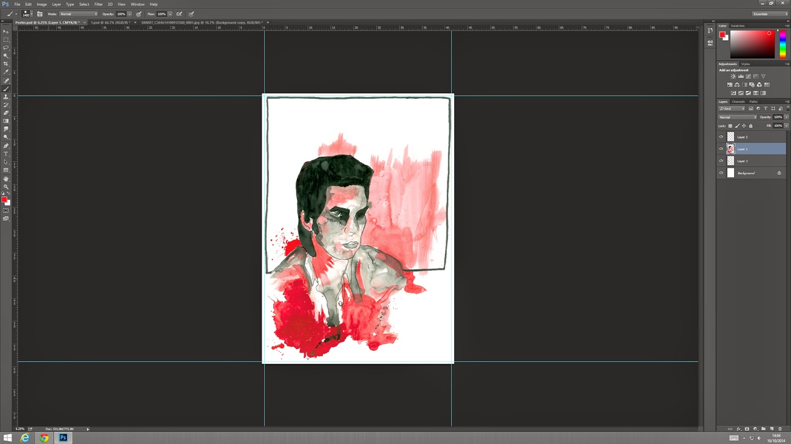
So as I previously posted I got to the stage of adding the red paint to the image of Nick Cave I had drew. After I scanned in the image I noticed that it was a very open image and that it needed something just to tie it all in and that's when I decided a border would work really well. Borders are on trend right now and I think it works really well. 
My next step was to fill in some of the blank space around Nick Cave's portrait. I took the red splats that I previously made and put them into Photoshop. I used the background eraser to remove the white background so I was just left with the red paint splatter and copy and pasted the sections I wanted onto my poster. I positioned one behind his head which I think represents death quite well as it symbolises a gun shot and I also placed a little splat in the bottom left corner just to fill in space which looked wrong. 
Next I realised that the paint, when scanned in, looks pink so I messed around with hue / saturation to make the paint red. I think it worked really well and it looks so much better. I noticed as well that when I changed the colour I got more texture in the paint which I really like because I think a block colour would have looked too simple and I think the texture adds to my concept of murder as it's really all about aggression and anger. 
The next stage was to create a title for the poster. My poster is basically advertising the album 'Murder Ballads' as if it was a new release or something. I was going to try creating my own font but I am not good at typography so I thought I would take a different route and use newspaper. This type of text was used quite frequently in the punk era and even though this album is categorised as alternative rock I still think this type face works well with the style of poster I have created and because the title has a ransom style that also ties in with my concept of Murder. To create this I basically bought a newspaper and cut out the letters to make 'Nick Cave', scanned them in a positioned them how I thought it looked good and then changed the layer to greyscale. I changed it to greyscale because there were a mixture of colours in the title such as reds and yellows and I just think it looks better considering there is so much colour and action in the drawing.
My next hurdle was choosing a type face for the other text on the poster. As I said before I am not good at typography so I chose to just go with a general font from Photoshop. I wanted a simple type face with a thin line and more spacing in between the letters than usual. There isn't any reasoning behind this I just think it would look much neater and crisp if it's easy to read and more people will be drawn to it if they can see clearly. I found 3 type faces that I liked the look of, this top one is called Courier New Regular.

This type face is Geniso Regular.

This type face is Letter Gothic Std Medium. I chose to go with the Geniso Regular because the line is nice and think, how I wanted it and I just really like it. The first one was too typewriter like and I think I just preferred the second one. 

This is where I decided to position the text. The text says '& The Bad Seeds' and I placed it under Nick Caves name as I thought it would fit well and I didn't want to isolate the text from the rest of the poster. I tried out different positions but I think this looked best. 

I then decided that the bottom right corner was really bare so I needed to add something. I thought about adding more red splats but I think if I added more red it would be over powering and it would be way too much for the eyes. This is when I decided to use the black splats i created with ink. I did the same as with the red paint and removed the background so it as transparent and found a cool splat shape to place in the corner. I tried it right in the bottom corner but I think it looked better when it overlaps the red and Nick Cave's shoulder. 


When I looked at the red background of Nick Cave I thought it was a bit bare so I thought I would add another image from my development into the poster. I chose one of the red hand prints I made and placed it onto the red painted background and changed the opacity of it so it wasn't too over powering. As is have previously mentioned I created the hand to look like a bloody hand has been rubbed onto something, like a bed sheet or something similar. I really like how this looks, I think it just adds a little something to the image and it's not in your face, it's subtly there in the background and I think it works really well.
it is hard to see the change in this image but I have selected the line of the border and changed the levels to make it darker. Before it was kind of a dark grey when I scanned it in so I just made it black basically. I think it looks so much better now that it is bolder and more like a border.

I have done 2 things in this image. I have selected the hair and the eyes and used a back soft brush to make the areas darker as I didn't like the dark grey colour as I thought it made the image look washed out and rushed. I think it looks so much better now. I also added more text to the poster, using the same type face as before I wrote 'Murder Ballads' on the space where the hand print is. I really like the placement of this text and I think I have used the space I have really well.

Over all I think my poster has turned out really well, I think it fits my target market of older teens to adults and I think it portrays my concept well also. When I print this it needs to be A2 in size and I have also added the 5mm bleed around the poster which is required on all final illustrations. I also have to submit this in a digital form which has to be 400 x 400px and 72dpi. 

Final Poster


Friday, 10 October 2014

Non - Narrative Illustration - Poster Development

After realising that the images I previously drew were really good for a poster I decided to work into it again. I basically just added a border to the images. Borders around illustrations are is a trend right now and I really like it, I used borders in some of my images from my Narrative project last year and I thought it looked really nice. I think a border finishes off an image really well. I added one to the image I didn't like at first just to see if it looked any better...it didn't. I still don't like it so this one will not be used. The second one however I think looks really good I didn't put the border all the way around, I just connected it to the ends of Nick Caves shirt and created a box above his head. I didn't want to put a border all around the image including the red because I think the image would lose it's freedom and loose effect. I think it works really well the way I've done it and I think this box area is where I will place the text for the advertising poster.  


Non - Narrative Illustration - Accidental Poster?!

After drawing the two Nick Cave portraits and experimenting with the red paint I did it with the intentions of making an album cover but when I looked at the images I created I thought they would be better to use as poster images. To create the images below I used red acrylic, black Molotow acrylic paint pen and black ink. The first image below was the first one I did. My initial idea was to have red paint rising from the bottom of the image, representing blood but it looks really bad, I thought it would be cool but it just looks horrible. The face is okay, I like the effect the red paint gives but I don't like the image as a whole. I took what I learned from this and developed it into the next image. I ditched the red paint rising from the bottom of the page and made a red paint splatter instead. I think it looks so much better and looser which I really like. I also took a technique from a previous drawing where I used the black ink and water to create tones in the face and added red paint to it as well. I really like this image, the tones have worked really well and the red looks awesome, in my opinion. I also took another technique from my other drawing and added a little bit of a red background behind and to the side of his face. I think this worked really well and I like the way it looks. As a final touch I added some red and black splashes of paint and ink to represent blood splatters, to link back to my concept. The red paint looks pink in some areas when I scanned the image so when I edit into a poster on Photoshop I will play around with the colours and hopefully change it up so it looks right. My next step is to also think about the text that will be on the poster, I am thinking of just having "Nick Cave and the Bad Seeds" and "Murder Ballads". 


Non - Narrative Illustration - Experimentation

I decided to experiment with black ink and red paint. For some of my ideas I need red splatters and black "explosions" so thats what I will show below. 

The red hand prints are for the hand gripping the sheet image, I think these worked really well and I like the effect it gives. I especially like the first one of the first image, it is my favourite one and I think it will work really well. All I did to make these was got messy! I painted my hand with watery red acrylic and slapped my hand onto the paper and dragged down and I got these from it.


Next I created some red blood spatters with the watery red paint. I really like these as they can be used for an assortment of things. I think I can put these into Photoshop and cut and paste them onto the poster or the album cover etc and it will be really effective.


The black ink splatters are for the gun idea. I had the idea of placing the black splats at the top of the fingers to make it look like the gun has fired. To do this I put a small blob of ink onto the page a blew it out into a splat. I'm not sure how this will look but next week is Photoshop week in my plan so I will have a play around with it on there and see what I can come up with.


Non - Narrative Illustration - Nick Cave Portrait - Ink

After I sketched out the Nick Cave portraits I went into a few with a Molotow acrylic pen and a Molotow Aqua pen for details and to get a stencil like effect. After trying this I thought I'd pick the 2 images I liked the best and develop those. I decided to go straight in with the red paint and black ink and I really like the outcome. 

These are the first two that I tried out, I like the effect the grey pen gives but I'm sure about using it in my final image.


I also tried out black ink and water to create shadowing and tones. I really liked the effect of this and may try it in my final images. 


After this experimentation stage I chose the two images that I was going to try out. Below you can see the inked outline of the two images I chose before I went in with red paint and black ink.


Non - Narrative Illustration - Alena Lavdovskaya / Fashion Editorial

As part of the Fashion Illustration section of this assignment I looked at fashion illustrator 

Alena Lavdovskaya for inspiration. I really like her work, she works in a minimalistic way and that's really effective. I like her use of line and shading in her images. I also like her sketches which have a slight bit of colour in them, I think it brings out the shapes of the figure really well. I don't think I am going to use colour in my illustration but I am definitely going down minimalist route and have a simple line drawing with some grey shading. I will probably use a fine liner or thin Molotow pen for the outline and then maybe water colours for the grey shading. I am quite excited to do this as I have never done a Fashion Illustration before and I really like trying out new things. I am not the best at people proportions either so I am hoping this will give me some practice in that area for in the future. below I will post some images of what I have sketched up so far. and I will also add some of Alena Lavdovskayas drawings to show her inspiration. You will see in my skecthes that I haven't drew a face, I am not the best at drawing faces in small detail so my idea to get around this was to just put in certain aspects of Nick Cave which stand out such has his hair and eyebrows, I like this idea and I think it works quite well.


Alena Lavdovskaya:


My sketches: 


Non - Narrative Illustration - Other Sketches

As well as sketching Nick Caves portrait I also had other ideas which I sketched out such as the womans hand in a gun gesture and a womans hand gripping bed sheets. My idea for the gun gesture is to have the hand as the center of the image with red painted nails, to symbolise lust, and blood splatters around it as if someone has been shot. The second one is also to represent lust and sex, which is touched upon in some of Nick Caves songs on the album, the idea was to have a womans hand grasping a bed sheet with blood smears around her fingers to suggest she has murdered someone. I really like these idea, I think I am leaning towards using a limited colour pallet and using only 3 colours, red, black and white. I think will also add to the concept of Murder really well. 


Non - Narrative Illustration - Nick Cave Sketches

As part of image development I thought that starting with drawing Nick Caves portrait would be a good place to start. Most albums / products and posters usually have the artists face on, for recognition purposes which is another reason I decided to sketch his portrait, for the reason that people will know immediately who it is. For the sketches I am going to show below I have used a HB 0.5mm mechanical pencil, a Molotow Aqua Ink pen and a Molotow 1.5mm Acrylic Paint pen. I decided to sketch from secondary research (photographs) of Nick Cave as obviously primary drawings / research is impossible in this situation. I will credit the photographer of the image I decide to use. In no way am I taking credit for the image, I will only take credit for the drawing.

My thoughts around these images is to use red and black paint / ink to indicate murder / blood. I will use red acrylic paint and work it around Nick Caves face for highlights around the black ink used for the shadow areas. I will also experiment with ink splats for added detail. The next stage of this will be to go around the image with black ink. 


Wednesday, 1 October 2014

Non - Narrative Illustration - Plan

5 weeks from today

Week 1 - 

Nick Cave sketches - Portraits for vinyl development (Various angles) although heading more towards front view. Full body for Fashion Editorial. Portrait for poster, will probably use a successful one from the portrait development. Woman's hand sketches (this relates to one of my vinyl packaging ideas). Bullet hole sketches (also relating to one of my ideas). 

(Vinyl ideas below)

Idea 1 - Black stencil style portrait of Nick Cave
Idea 2 - ''                              ''                              ''
Idea 3 - Woman's hand in clawing position.
Idea 4 - Woman's hand in gun gesture position.
Idea 5 - Bullet hole on front and back of the vinyl packaging and on the vinyl sticker.

(Fashion Editorial)

Stood up pose in a suit - the style of Nick Cave which I researched. I want this to look like a finished rough sketch (I know what I mean). Pencil and fine liner (molotow)

Week 2 -

For each one of the ideas I have, develop the backgrounds and bases using a range of medias and techniques. Acrylic, oils, watercolour, ink etc. 

(Vinyl)

Idea 1 - Red smudging from bottom / top (depending which I choose) and also work the red around Nick Caves portrait.
Idea 2 - Red blood splatter - Ink and / or acrylic paint (will do loaaaaads of these, probably in print room)
Idea 3 - Red finger smudges - using same media as the previous ideas I will use my own fingers to create a smudgy hand print as if down fabric.
Idea 4 - Maybe have a burst of dust / explosion from the gun - black paint / ink? Straw?
Idea 5 - Red blood dripping from bullet hole - ink or paint - Possibly acrylic to get a thicker line or printing ink.

(Poster) 

Experiment with backgrounds for the poster 

Week 3 - 

(Vinyl)

Finalize sketches and assemble them with the background developments to see how they fit together - Photoshop. Finalize fashion illustration if I haven't already.

Start thinking about and designing text for poster and vinyl - newspaper?

Play around with developed images and background for the poster and assemble a few on Photoshop.

Week 4 -

Use existing development work to create apparel and maybe greetings cards / postcards if I have the time.

Finalize poster on Photoshop

Finalize designs for apparel and postcards 

Make sure all pieces of work are to the correct scale etc and print out everything that is necessary

Week 5 - 

If all work is complete create apparel - t-shirts

and postcards 

Finalize everythiiiiiing


This is just a personal plan for the next 5 weeks of this module so I can relate back and check off everything I do as I do it. I will also be blogging around this plan and writing about my process and if things have gone well etc.