Friday, 10 October 2014

Non - Narrative Illustration - Experimentation

I decided to experiment with black ink and red paint. For some of my ideas I need red splatters and black "explosions" so thats what I will show below. 

The red hand prints are for the hand gripping the sheet image, I think these worked really well and I like the effect it gives. I especially like the first one of the first image, it is my favourite one and I think it will work really well. All I did to make these was got messy! I painted my hand with watery red acrylic and slapped my hand onto the paper and dragged down and I got these from it.


Next I created some red blood spatters with the watery red paint. I really like these as they can be used for an assortment of things. I think I can put these into Photoshop and cut and paste them onto the poster or the album cover etc and it will be really effective.


The black ink splatters are for the gun idea. I had the idea of placing the black splats at the top of the fingers to make it look like the gun has fired. To do this I put a small blob of ink onto the page a blew it out into a splat. I'm not sure how this will look but next week is Photoshop week in my plan so I will have a play around with it on there and see what I can come up with.


Non - Narrative Illustration - Nick Cave Portrait - Ink

After I sketched out the Nick Cave portraits I went into a few with a Molotow acrylic pen and a Molotow Aqua pen for details and to get a stencil like effect. After trying this I thought I'd pick the 2 images I liked the best and develop those. I decided to go straight in with the red paint and black ink and I really like the outcome. 

These are the first two that I tried out, I like the effect the grey pen gives but I'm sure about using it in my final image.


I also tried out black ink and water to create shadowing and tones. I really liked the effect of this and may try it in my final images. 


After this experimentation stage I chose the two images that I was going to try out. Below you can see the inked outline of the two images I chose before I went in with red paint and black ink.


Non - Narrative Illustration - Alena Lavdovskaya / Fashion Editorial

As part of the Fashion Illustration section of this assignment I looked at fashion illustrator 

Alena Lavdovskaya for inspiration. I really like her work, she works in a minimalistic way and that's really effective. I like her use of line and shading in her images. I also like her sketches which have a slight bit of colour in them, I think it brings out the shapes of the figure really well. I don't think I am going to use colour in my illustration but I am definitely going down minimalist route and have a simple line drawing with some grey shading. I will probably use a fine liner or thin Molotow pen for the outline and then maybe water colours for the grey shading. I am quite excited to do this as I have never done a Fashion Illustration before and I really like trying out new things. I am not the best at people proportions either so I am hoping this will give me some practice in that area for in the future. below I will post some images of what I have sketched up so far. and I will also add some of Alena Lavdovskayas drawings to show her inspiration. You will see in my skecthes that I haven't drew a face, I am not the best at drawing faces in small detail so my idea to get around this was to just put in certain aspects of Nick Cave which stand out such has his hair and eyebrows, I like this idea and I think it works quite well.


Alena Lavdovskaya:


My sketches: 


Non - Narrative Illustration - Other Sketches

As well as sketching Nick Caves portrait I also had other ideas which I sketched out such as the womans hand in a gun gesture and a womans hand gripping bed sheets. My idea for the gun gesture is to have the hand as the center of the image with red painted nails, to symbolise lust, and blood splatters around it as if someone has been shot. The second one is also to represent lust and sex, which is touched upon in some of Nick Caves songs on the album, the idea was to have a womans hand grasping a bed sheet with blood smears around her fingers to suggest she has murdered someone. I really like these idea, I think I am leaning towards using a limited colour pallet and using only 3 colours, red, black and white. I think will also add to the concept of Murder really well. 


Non - Narrative Illustration - Nick Cave Sketches

As part of image development I thought that starting with drawing Nick Caves portrait would be a good place to start. Most albums / products and posters usually have the artists face on, for recognition purposes which is another reason I decided to sketch his portrait, for the reason that people will know immediately who it is. For the sketches I am going to show below I have used a HB 0.5mm mechanical pencil, a Molotow Aqua Ink pen and a Molotow 1.5mm Acrylic Paint pen. I decided to sketch from secondary research (photographs) of Nick Cave as obviously primary drawings / research is impossible in this situation. I will credit the photographer of the image I decide to use. In no way am I taking credit for the image, I will only take credit for the drawing.

My thoughts around these images is to use red and black paint / ink to indicate murder / blood. I will use red acrylic paint and work it around Nick Caves face for highlights around the black ink used for the shadow areas. I will also experiment with ink splats for added detail. The next stage of this will be to go around the image with black ink. 


Wednesday, 1 October 2014

Non - Narrative Illustration - Plan

5 weeks from today

Week 1 - 

Nick Cave sketches - Portraits for vinyl development (Various angles) although heading more towards front view. Full body for Fashion Editorial. Portrait for poster, will probably use a successful one from the portrait development. Woman's hand sketches (this relates to one of my vinyl packaging ideas). Bullet hole sketches (also relating to one of my ideas). 

(Vinyl ideas below)

Idea 1 - Black stencil style portrait of Nick Cave
Idea 2 - ''                              ''                              ''
Idea 3 - Woman's hand in clawing position.
Idea 4 - Woman's hand in gun gesture position.
Idea 5 - Bullet hole on front and back of the vinyl packaging and on the vinyl sticker.

(Fashion Editorial)

Stood up pose in a suit - the style of Nick Cave which I researched. I want this to look like a finished rough sketch (I know what I mean). Pencil and fine liner (molotow)

Week 2 -

For each one of the ideas I have, develop the backgrounds and bases using a range of medias and techniques. Acrylic, oils, watercolour, ink etc. 

(Vinyl)

Idea 1 - Red smudging from bottom / top (depending which I choose) and also work the red around Nick Caves portrait.
Idea 2 - Red blood splatter - Ink and / or acrylic paint (will do loaaaaads of these, probably in print room)
Idea 3 - Red finger smudges - using same media as the previous ideas I will use my own fingers to create a smudgy hand print as if down fabric.
Idea 4 - Maybe have a burst of dust / explosion from the gun - black paint / ink? Straw?
Idea 5 - Red blood dripping from bullet hole - ink or paint - Possibly acrylic to get a thicker line or printing ink.

(Poster) 

Experiment with backgrounds for the poster 

Week 3 - 

(Vinyl)

Finalize sketches and assemble them with the background developments to see how they fit together - Photoshop. Finalize fashion illustration if I haven't already.

Start thinking about and designing text for poster and vinyl - newspaper?

Play around with developed images and background for the poster and assemble a few on Photoshop.

Week 4 -

Use existing development work to create apparel and maybe greetings cards / postcards if I have the time.

Finalize poster on Photoshop

Finalize designs for apparel and postcards 

Make sure all pieces of work are to the correct scale etc and print out everything that is necessary

Week 5 - 

If all work is complete create apparel - t-shirts

and postcards 

Finalize everythiiiiiing


This is just a personal plan for the next 5 weeks of this module so I can relate back and check off everything I do as I do it. I will also be blogging around this plan and writing about my process and if things have gone well etc. 


Tuesday, 30 September 2014

Non - Narrative Illustration - Goya

As my concept is 'Murder' I looked at an artist called Francisco De Goya, or just Goya. Goya was a Spanish painter and print maker. I decided to look at him because his work is really dark and he once created a print series called Disasters of War and these prints were seen as a protest against the violence of war. The prints are rather graphic, showing the death of war, this is part of the reason I chose to look at his work. I really like the dark background of his prints but I also really love prints themselves. I think they give such a nice effect ad I think if you try hard enough can create something really effective by using different materials and tools to mark make on the surface. The series can be split into 3 different stages, prints 1 - 47 focus n war incidents and shows conflicts on soldiers and civilians. prints 48 - 64 show the famine that Madrid had been caught up in and the last 17 prints reflect the hierarchy. As my concept is Murder I think this artist and this series fits quite well. I also think that because my target audience is older teenagers and adults this is an appropriate artist to look at without it being offensive. 

Below I will insert some prints from the Disasters of War series and some of his other prints too. 


Friday, 26 September 2014

Non - Narrative Illustration - Fashion Editorial Illustration

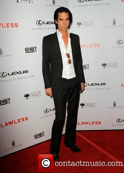
I have decided to create a Fashion Editorial Illustration, I found online a site where it tells me what Nick Caves fashion sense is. He is well known as a man who wears a dark, tailored suit with no tie, his top buttons of a white shirt undone and sicked back hair. He also rolls his shirt up to above his elbows which apparently is where no man would ever wear their shirt. This gives me perfect imagery for my illustration and I am really looking forward to drawing it. 


Here are some images of his attire.


I also looked at male fashion illustrations to give me some idea of how the profession of a fashion illustrator works. The images were really helpful and I now have a better understanding of how a fashion illustration should look. 

Here are some examples of what I found.


Non - Narrative Illustration - Vinyl Packaging

I found a website online where it tells me all of the measurements needed for 12" Vinyl Packaging. This is going to be really helpful when I come to create my packaging. http://www.piratespress.com/cms/12-inch


The image above is an example of the templates you can download from that website I linked. It is a screen shot of the PC screen because the image size was too big to upload.

I have also been looking at different way of creating vinyl packaging, I found a few interpretations of a vinyl cover, the first being just the simple one side slit sleeve with a hole cut out of the front, a single slit sleeve with no hole (most common), a one where is a top slit sleeve at the back and a book at the front, I really like this idea, I feel like you could write song lyrics on the different pages like you do in CD inserts. There was also a concertina style cover where it was able to hold 3 vinyls and it opens out in a zigzag shape which I thought looked really cool and lastly I found one in a box which I think is a cool idea. After looking at these designs I feel like it would be really awesome to create something a little bit different rather than create the simple side / top slit sleeve, I think, depending on the illustration I do for the album, I will consider which style would be best for what I design. I would rather create the design then work it around a vinyl sleeve than pick a vinyl sleeve and work an illustration around that, this is just in case I change my mind on the style of packaging I want to produce.


I also looked at some of the most famous album art works which I like the style of. The purpose of this was to just grab some inspiration of simplistic album artwork and to analyse and think about how the artist has created the design. 


The front cover of this consisted of a photograph of The Clash's bassist smashing his bass on stage at The Palladium in New York. The photographer of the image, Pennie Smith, refused to let them use this image as she wasn't fully happy with the result with it being out of focus but that was until graphic designer Ray Lowry said it would make a good album cover and then the photograph was named the best rock and roll photograph of all time. The album cover was designed by Ray and is a homage of Elvis Presley's self titled album. I have mixed feelings about this because I like the photograph but the fact that this is a homage puts me off a little. 

The artwork for The Dark Side of the Moon by Pink Floyd was designed by George Hardie. They had a few different designs to choose from but they decided that the prism was the best to choose. There were 3 aspects the band wanted to be shown through the album art and that was stage lighting, the lyrics to the album and the fact they wanted it ''simple and bold''. This is probably one of the most famous album covers of all time and I like it because it is in fact simple and bold and I really like the black background. 
This is also one of the most well known albu covers in music. It was designed by Peter Saville who has history of designing posters. The image is radio waves from The Cambridge Encyclopedia of Astronomy. Saville simply inverted the colours of the sound wave and printede it onto textured card for the album. And since then this art work has been iconic even outside of the music industry. I really like this because of the contrast between the black and white. I also really like the line, it has a texture and it looks really nice.
 (Apologies for explicit text)
This obscene title came from 2 Sex Pistols fans who would always say it to each other and it means to stop talking rubbish. They had to start removing or toning down their public posters because of the cover. The cover was designed by Jamie Reid. He states that he sees punk as an art form therefore the pop phenomenon was not what interested hi. His designed were mostly anti-establishment and complicated and after the release of this album punk bands started using the ransom-not lettering a lot more. When I see a design like this I immediately think Punk. I associate this type of art with punk music and bands and I really like it. I'm not too keen on the colours of this cover but the text is what draws me in.
This has to be Nirvana's most famous album, mostly due to it's album cover. When watching a show about water births Kurt Cobain said that's when he came up with the idea of this. Robert Fishers hired a photographer to go to a pool for babies and take pictures. The baby on the cover is called Spencer Elden and he was the son of the photographers friend. There was some concern about this image as you can see the boys circumcised penis and an alternative cover was mentioned where there wouldn't be a penis visible but Kurt said no and said that he would accept if there was a sticker covering the penis saying "if you're offended by this, you must be a closest pedophile.'' I think the imagery is awesome for this album but I don't think it is as good as some of the rest. I don't get much inspiration from this.

This is Blur's 'best of' album and it was created by Juian Opie and the original painting can be found in the National Portrait Gallery in London and this album has some similarities to Queens Hot Space.
I really like this album cover, the colours that have been used are really effective and resemble pop art. The stencil like portraits also resemble pop art and it gives the album a real simple look but it is also really effective and has became one of the most famous album artworks.