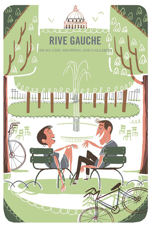
As I am designing an illustrated travel guide I looked at already existing illustrated guides. I looked at the colour palettes used, the style of drawing and the layout of images. I found that illustrated travel guides are either black and white or have a minimal but bright colour palette. For me the colour illustrations work much better as I think it brings character into the guide and makes it much more inviting. The black and white guides would be better for an older generation, I believe, but as my designs are aimed towards families with young children and their parents would generally be in the range of 25-35 years old I think colour illustrations will be best fitted. The style of drawing of the majority is pretty simplistic but it works well, the illustrations are made up of coloured shapes rather than realistic and tonal drawings and I think this adds to the characteristics of the guide. Some of the layouts are really interesting, they are sometimes set out in an abstract way and whilst this looks amazing I think it would be a little hard to follow. I like the idea of a double page spread image for separation pages, I think big bold images work really well to differentiate one topic from another. Illustrated travel guides are so hard to find in stores and travel agents and this is a great opportunity for me as it is a gap in the market and people will notice mine against the rest of the regular guides.


No comments:
Post a Comment