
Thursday, 26 February 2015
Negotiated Project - Bradt Travel Guide Publisher
Bradt Travel Guide publishing was set up over 40 years ago by Hilary Bradt and her husband George. They went on a trip to the Amazon where they wrote their first travel guide. Bradt Travel Guides produce full-country travel guides, regional guides, wildlife guides and travel literature. Bradt Travel Guides have won many awards for their useful publications and I think this is the kind of publisher I'd prefer my travel guide to be published with. They aren't too well known but their success rate is fantastic. They have over 200 publications for many different countries. They don't produce illustrated travel guides but I would like to base my sizing around that of their usual travel guides.

Tuesday, 24 February 2015
Negotiated Project - Maja Wronska
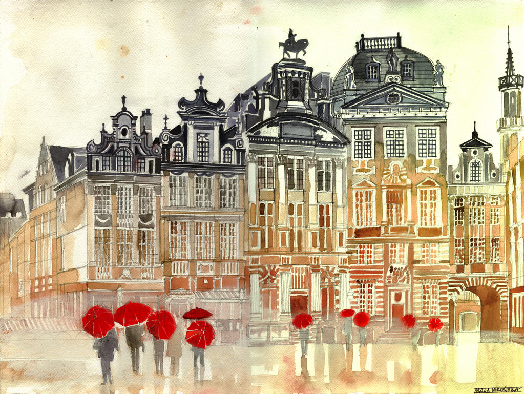
Maja Wronska is yet another architectural illustrator that I came across whose work closely resembles that of Sunga Park. Sunga Park is one of my favourite artists and I was happy to find another illustrator who creates work like his. She creates illustrations using and ink pen and washes of watercolour paint. I like the effect that the watercolour gives. I like her use of gradient when she paints the illustrations, they are usually set out into three sections where the colours gradually get lighter the further down the image you look. I think it is much more expressive than the simple use of one colour which Sunga Park usually does.


Negotiated Project - Florian Afflerbach
Florian Afflerbach is an illustrator who I found which creates architectural drawings with ink and watercolour. His drawings are rather accurate in the sense that all of the lines are perfectly positioned, straight and parallel where needed. His drawings are mainly on a kind of coffee wash background and I think this takes the harshness away from the line of the drawing. On some of his drawings he introduces colour with a small wash of watercolour paint which adds a nice touch to the illustration.


Negotiated Project - Michael Tompsett
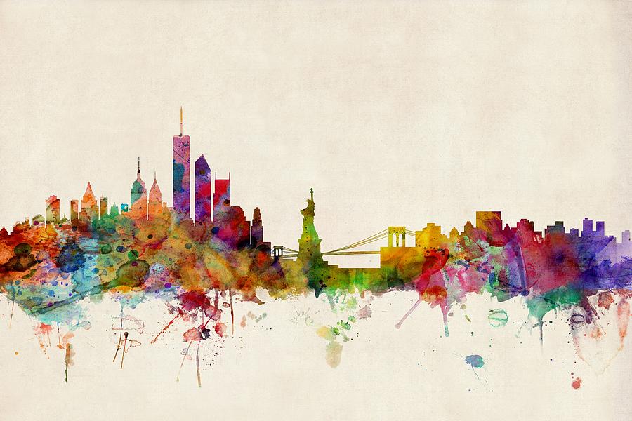
Michael Tompsett is an illustrator I found who creates images of city sky lines in a colourful way and he also creates birds eye view maps and I think this is quite relevant to my project. His sky line illustrations are very much all similar where he has the simple shape of the sky line and fills the shape with very vibrant and expressive colours but there are a few which look like he has used watercolours and the image is much more subtle and they look much better than the vibrant ones. His maps are the same in the sense of some are vibrant and expressive and others are rather simplified and soft. In my opinion the more subtle illustrations are the ones I'm drawn more to and the others don't really inspire me.


Negotiated Project - Illustration / Andrew Hall
The book 'Illustration' by Andrew Hall is basically a book about the processes and the achievements of being an illustrator. In this book I found a small image by an illustrator named Patrick Vale, he creates a lot of architectural illustrations and looking at his images he creates a variety of line thickness using black ink. Some of his illustrations are on coloured background and I like the use of block colours with no shade or tone. I also looked at the illustrations that were used to create the illustrated animation in the music video for Babyshambles "French Dog Blues". I really like the use of colour in these initial illustrations, they are kinda of just shadows on the image but the blue colour just gives it something more than if it was grey.


Negotiated Project - Illustration Next
Illustration Next is a book pretty much the same as Illustration Now. It is a book which contains pages and of pages of different contemporary illustrators. I found an illustrator named Irkus M. Zeberio and I really like his sketchy style illustrations. His use of line is really interesting and the limited colours he uses give the illustrations a splash of excitement. The line work of Ryan Cecil Smith caught my attention. I really like the rough line style, it looks traditionally drawn but I think it's actually digital. He uses colour in some of his illustrations but personally I think the black and white line drawings are much better. Julia Rothman has done a few landscape illustrations which have a lot of character, in my opinion. The line she uses isn't accurate but it still works really well. Her light washes of colour bring out the images and I like the fact there isn't much tone. The illustrations are rather flat but they are still fantastic representations of the buildings and landmarks she has drawn.


Negotiated Project - Illustration Now 3
Illustration now is a book series which demonstrates the work from a number of modern illustrators and their techniques and way of working. I looked at the third book, illustration now 3 and I found some really interesting artists such as Steve Brodner. He works with watercolour on paper and his illustrations have amazing texture and the style of drawing is rather interesting. I like the traditional look yet it also looks like it has been digitally built up. The line work of Christina Drejenstam is really nice and has fluidity. I like the small splashes of colour in her illustrations, it breaks up the image really well and adds an extra pop. Her materials include; pen, pencil, watercolour, spray paint and Photoshop. She describes her work as being "simplified and rich in detail at the same time" and that's exactly what it is. Natsko Seki is a mixed media illustrator who has a very precise architectural drawing style which is something that I need to look into. In some illustrations I have seen of his the drawings of buildings and landmarks are drawn in blue and I think the subtlety of the line ties the whole image in together.


http://stevebrodner.com/
http://www.drejenstam.se/
http://www.natsko.com/
Negotiated Project - Berlin
Travel guides are full of very useful and essential information and even though I don't need to write out the information, as I'm only designing the pages, I will be looking at what topics are addressed so I know what subjects I need to illustrate. The most common and most needed topics of information are as follows; an introduction to the city, areas around the city, places to stay, restaurants and cafes, shops and markets, entertainment, tourist attractions, getting around the city and useful phrases. The topics will help me come up with illustration ideas that fit well with the themes of the different sections. The guides will visually represent the city and the colour pallet will be determined after some experimentation. I am leaning towards using German colours, yellow, black and red.


Tuesday, 17 February 2015
Negotiated Project - Children's Guides / Activity Books
As I am designing an additional guide / activity book for children I looked at children's travel guides and travel activities. There aren't many children's guides around but I found a lot of inspiration for the activity second of the children's guide. I found a book online called Find and Seek Singapore which is an introduction to Singapore for children and the style of illustration is similar to that of the illustrated travel guides I've previously blogged about. It has a limited colour palette and like the illustrated guides this book has illustrations made up of coloured shapes. I also found on the Usborne website of children's book a lot of activity books for children which gives me a starting point for my designs. Things that are in the activity books include find the object images, colouring in images, fact pages, spot the difference etc. My children's guide will be a mixture of activities and guidance so they can learn and explore as well as have fun.
http://www.usborne.com/catalogue/travel-activities.aspx


http://www.usborne.com/catalogue/travel-activities.aspx


Negotiated Project - Illustrated Travel Guides
As I am designing an illustrated travel guide I looked at already existing illustrated guides. I looked at the colour palettes used, the style of drawing and the layout of images. I found that illustrated travel guides are either black and white or have a minimal but bright colour palette. For me the colour illustrations work much better as I think it brings character into the guide and makes it much more inviting. The black and white guides would be better for an older generation, I believe, but as my designs are aimed towards families with young children and their parents would generally be in the range of 25-35 years old I think colour illustrations will be best fitted. The style of drawing of the majority is pretty simplistic but it works well, the illustrations are made up of coloured shapes rather than realistic and tonal drawings and I think this adds to the characteristics of the guide. Some of the layouts are really interesting, they are sometimes set out in an abstract way and whilst this looks amazing I think it would be a little hard to follow. I like the idea of a double page spread image for separation pages, I think big bold images work really well to differentiate one topic from another. Illustrated travel guides are so hard to find in stores and travel agents and this is a great opportunity for me as it is a gap in the market and people will notice mine against the rest of the regular guides.


Negotiated Project - Travel Guides
The first stage of research I am doing is looking at the layouts and style of already existing travel guides.
The first guide I looked at was Eye Witness Travel Guides: Rome. I did try and find a Berlin one but there weren't any available in the library. The travel guide has end papers of maps which can be really helpful to the reader. The pages are set out into 3 columns which are then broken down into squares and rectangles of text. I think this layout is confusing to follow, I think it would be improved if there was maybe one left column so there could be more clear blocks of text. The guide is separated into different sections and these sections are divided by a double page spread of an image of the city and a title page. I think this is a good clear indication that you are entering a new topic and I believe that this is an essential to have in a guide. Throughout the book there are small photographs and some illustrative images placed in relevant areas and photographs are a very important part of a travel guide, although in the one I design I will have more illustrations than photographs. The layout of the restaurants and places to stay are set out in squares, again in 3 columns, with a background behind the text. Pages that consist of all text have illustrative backgrounds. The size of the book is a little bigger than A5 and I think this is a perfect size for a travel guide as it's small enough to carry around but big enough to be able to read the text etc. Overall I think this is a very well planned out travel guide, it contains a lot of essential information but in my opinions the overall aesthetics of the guide aren't the best.

I next looked at a Mini Guide to North East of England. Again, not Berlin, but I really liked the look of this guide. The pages of this book have 2 columns which I think is much better than the last one I looked at. It's much easier to follow and read. The pages have titles down the outside edge of them which are also colour coded. Colour coding is a really good quick and easy thing that will help the reader find what they are looking for faster. The information on the inside consists of text, images and advertisements. I think images are very important in a travel guide because if you're unfamiliar with the area you are in, images are a great way to figure out where you are and if you are at the correct location. Another really important part of this guide which is really helpful are bus and train maps, these are a great help when you aren't sure on your location and need to travel by public transport. The size of the guide is a tad wider than A6, I think this is a great pocket size but if I am to design a guide with illustrations I feel I will need to design it a bit bigger. Overall the layout and general look of this guide is quite good, I like the colour coding and the clear text, I think it works really well.

The next guide I looked at was a Welcome Card from when I visited Berlin. The welcome card has pages of 2 columns which, as I have previously stated, are much easier to follow and read. The different sections are also colour coded and this helps with convenience. They also have separation pages which are full colour with a small illustration in the bottom corner which represents the section topic, this is good because it's a clear indication of what you are about to read. At the back of the guide there are a few 'notes' pages and I think this is a good idea in the case of the reader needing to take note of things like train times / stations etc. and the note pages provide a safe, convenient place to jot these. The best thing about this is that it has a huge fold out map which tucks nicely into the cover of the book. I find that a bigger map would be easier to read and follow, and if you didn't want to take out the big map there are smaller maps on the inside as well. The book is around A6 in size and this is a nice pocket sized guide but as I previously said, a slightly bigger one would be better. Overall I think this is quite a well planned and thought out guide, there is a lot of information but the aesthetics aren't too great, the best part of the image of the book is the separation pages.

I looked at a travel guide for students and it was mostly text based but the small parts of illustration / images were really nice. The guide was fully black and white and the little touches of imagery were things such as photographs with old photo style borders around them and ink stamped postcard stamps. I think the guide was best for information but there could have been a lot more imagery but the imagery that was there was quite strong and bold.

The first guide I looked at was Eye Witness Travel Guides: Rome. I did try and find a Berlin one but there weren't any available in the library. The travel guide has end papers of maps which can be really helpful to the reader. The pages are set out into 3 columns which are then broken down into squares and rectangles of text. I think this layout is confusing to follow, I think it would be improved if there was maybe one left column so there could be more clear blocks of text. The guide is separated into different sections and these sections are divided by a double page spread of an image of the city and a title page. I think this is a good clear indication that you are entering a new topic and I believe that this is an essential to have in a guide. Throughout the book there are small photographs and some illustrative images placed in relevant areas and photographs are a very important part of a travel guide, although in the one I design I will have more illustrations than photographs. The layout of the restaurants and places to stay are set out in squares, again in 3 columns, with a background behind the text. Pages that consist of all text have illustrative backgrounds. The size of the book is a little bigger than A5 and I think this is a perfect size for a travel guide as it's small enough to carry around but big enough to be able to read the text etc. Overall I think this is a very well planned out travel guide, it contains a lot of essential information but in my opinions the overall aesthetics of the guide aren't the best.
I next looked at a Mini Guide to North East of England. Again, not Berlin, but I really liked the look of this guide. The pages of this book have 2 columns which I think is much better than the last one I looked at. It's much easier to follow and read. The pages have titles down the outside edge of them which are also colour coded. Colour coding is a really good quick and easy thing that will help the reader find what they are looking for faster. The information on the inside consists of text, images and advertisements. I think images are very important in a travel guide because if you're unfamiliar with the area you are in, images are a great way to figure out where you are and if you are at the correct location. Another really important part of this guide which is really helpful are bus and train maps, these are a great help when you aren't sure on your location and need to travel by public transport. The size of the guide is a tad wider than A6, I think this is a great pocket size but if I am to design a guide with illustrations I feel I will need to design it a bit bigger. Overall the layout and general look of this guide is quite good, I like the colour coding and the clear text, I think it works really well.
The next guide I looked at was a Welcome Card from when I visited Berlin. The welcome card has pages of 2 columns which, as I have previously stated, are much easier to follow and read. The different sections are also colour coded and this helps with convenience. They also have separation pages which are full colour with a small illustration in the bottom corner which represents the section topic, this is good because it's a clear indication of what you are about to read. At the back of the guide there are a few 'notes' pages and I think this is a good idea in the case of the reader needing to take note of things like train times / stations etc. and the note pages provide a safe, convenient place to jot these. The best thing about this is that it has a huge fold out map which tucks nicely into the cover of the book. I find that a bigger map would be easier to read and follow, and if you didn't want to take out the big map there are smaller maps on the inside as well. The book is around A6 in size and this is a nice pocket sized guide but as I previously said, a slightly bigger one would be better. Overall I think this is quite a well planned and thought out guide, there is a lot of information but the aesthetics aren't too great, the best part of the image of the book is the separation pages.
I looked at a travel guide for students and it was mostly text based but the small parts of illustration / images were really nice. The guide was fully black and white and the little touches of imagery were things such as photographs with old photo style borders around them and ink stamped postcard stamps. I think the guide was best for information but there could have been a lot more imagery but the imagery that was there was quite strong and bold.
Monday, 16 February 2015
Negotiated Project - Initial Idea
Recently I took a trip to Berlin and whilst there I had the task of coming up with ideas for the new Negotiated Project. The Negotiated Project gives me the opportunity to propose any brief that I would like to do, within reason of course, and it must have a commercial outcome. I am to write a learning agreement for my chosen brief and then propose it to my module tutors and they will then inform me on whether it is good enough to go ahead with.
Whilst in Berlin I didn't get much inspiration from anything and I came back with no idea of what I could do. But after a little bit of thinking I decided I would create a family travel guide to Berlin, this will include a travel guide for adults and a separate activity / travel guide for children. My aim is to design a travel guide which is aesthetically pleasing to the audience, unlike normal travel guides found in travel agents etc. I also believe that the children's travel guide / activity book will be a great addition to a family travel pack because it will keep the children entertained whilst travelling to Berlin and whilst exploring the city.
My research will include looking at layouts and styles of travel guides, illustrated travel guides, contemporary illustration and other artists that are relevant to my project.

My research will include looking at layouts and styles of travel guides, illustrated travel guides, contemporary illustration and other artists that are relevant to my project.
Subscribe to:
Comments (Atom)