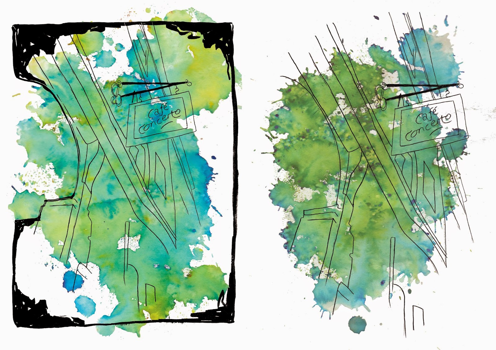
Below you can see the comparison between all of the images with and without the border. In my opinion the images without the border are more effective and easier to look at. I think the border is too much on the illustration and takes the attention away from the line drawing itself. Even though the border makes the image look more finalised the ones without look cleaner and will fit better with the theme of the magazine.


There was also one image which didn't make the final illustrations, the reason behind this was because the drawing was landscape and the rest were portrait and it wouldn't have fit right and I think 6 is a good amount for a series of illustrations. Below is the image not used. I suppose I could have used it when I decided not to use the borders but I didn't really like the drawing and it just didn't look too great.

No comments:
Post a Comment