Monday 12 January 2015

Commercial Image Creation - Evaluation

At the beginning of the module we were given a range of brief to choose from, ome more open than others. I chose the One & Another brief. The aim of this project was to create a series of illustrations (minimum of 4) for a magazine called One & Another based around either The Underground Music Scene or Cafe Culture of York. After researching both subjects I chose to do the Cafe Culture of York as it was a subject that I was drawn to more than the Underground Music Scene. 

I looked at 3 artists Veronica Lawlor, Julia Sverchuk and Sunga Park. All 3 are reportage artists yet they all have a different approach to it. I really liked the lines they all use but I really like the technique Sunga Park uses for his water colours. I took a lot of inspiration from Sunga Park by doing a black line drawing and using coloured ink for the background. 


At the start of the project I took a few trips to York and went into a few cafes for research and drawing purposes. I did some reportage drawings but I only stuck to pencil and Aqua Ink Molotow pens. After the reportage I re drew from photographs I had taken just to clean up the lines and make the image more accurate. I wasn't sure on my idea at this point as I hadn't received the mood board from the client so I just did some drawings. I did a drawing of each cafe, one with a border and one without, for experimentation reasons.


My initial idea was to go along the lines of what Sunga Park does and draw the cafe in black fine liner and use some kind of water colour / ink to give the image colour and depth. I also had the idea of collecting napkins, leaflets and menus and making a collage for the background of my illustrations but this proved difficult when not all of the cafes had the things I needed. Nearing to the point where I needed to start thinking about creating my images, the client who wrote the brief still hadn't sent me the document I needed. This mood board would have told me what was expected, what style, what ideas, and the colours which she would have liked the illustrations but instead I had to create everything myself and come up with every little idea in less time than I expected. This situation didn't cause many problems but it did drag my project on a little which gave me less time to create my illustrations. 

Due to the client not sending me the document at all I had to start thinking of another idea. My new idea was pretty simple. I would use the drawings from my sketchbook and then create a background using Brusho. I think Brusho was a good choice as the colours are really loud and eye-catching. I tried out a few different techniques with the Brusho. The first did not work so well as the colour was too strong and the Brusho powder had clumped on top of the image and it did not look good at all. This technique was wetting the page with water and then sprinkling the Brusho on the top. After the first technique failed I took a different approach. I sprinkled the Brusho colours onto the page first and then used a sponge to squeeze water on top of the powder. This created large beads of water on the page which I then soaked back up with the sponge leaving only a light patch of colour on the page. This technique worked much better because I had a little bit more control and the colour and shape came out really well and I think they will be perfect to use in my illustrations.


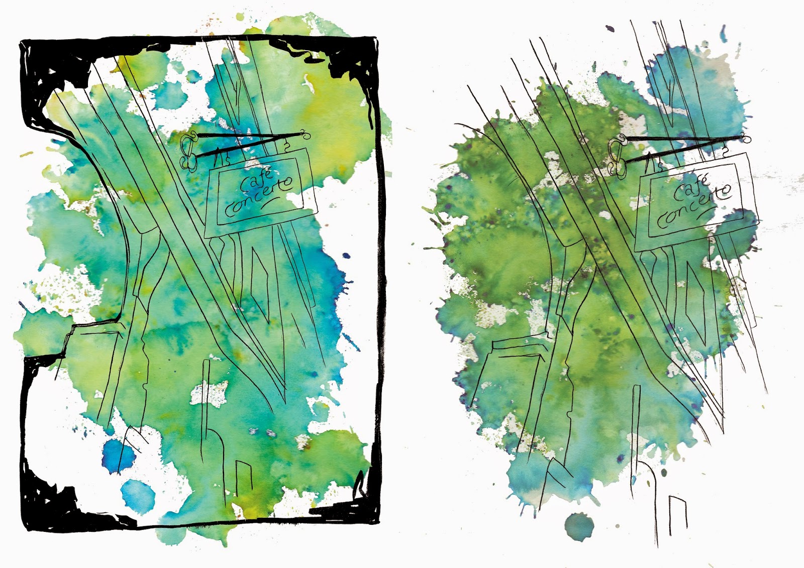
To create my images I went through a simple but long process. I started out by scanning in all of the sketches, ones without borders and ones with. I then put them into Photoshop and took away the background so that only the line was left. To do this I went into the select tab, clicked on colour range and chose the white background of the image with the colour dropper and then deleted the areas it selected. I then used the levels tool to make the pencil line black. I could have made this easier and skipped this step if I had drawn over the line with a fine liner before scanning. Next I scanned in the Brusho pages and went through the same process as above, I deleted the background so that only the Brusho was left and the background was transparent. I then chose one sketch (with a border) and one Brusho image and assembled them together. I changed the opacity of the Brusho on some of the images as it was a little overpowering and it was hard to see the line. After I created all of the images with the black borders I decided they might look better without the border as it took away the attention from the line drawing which is the main part of the illustration. So I saved those images and created a new set without the border and I like them so much better. They are so much more simplified but I think it works. I think as well because the magazine style is rather clean the thick black border wouldn't have fit well with the theme of the magazine. (I created a comparison image which will be shown below). The colours I used for the Brusho were blue/red and yellow/green and this is because these are the colours I've seen most throughout the magazine issues and as my audience is teens and young adults I think these colours are most aesthetically pleasing and will be noticed. Because I didn't receive the information from the client I had to figure the size of the illustrations out myself. The magazine is around A4 size so I created an A4 sized canvas on Photoshop then put the images on one at a time and shrunk the image so there was a 1.6cm border all the way around, and an extra 5mm bleed. The purpose of the border is so if the illustrations were to be printed in the magazine there will be a lot of spare space around the edges for printing error. Also, because I planned on these images being full page the border will allow them to be centered rather than take up a large portion of the page but still be a full page illustration. I also printed out the illustrations on 4 types of paper in the case of making prints in future. I used regular cartridge paper, Matte, glossy and luster. Unfortunately I could only print 3 of the glossy and luster but out of all of the papers I think Matte would be best for prints as the paper is clean and white and the colours are vibrant and for the magazine it would obviously be printed onto glossy paper and that came out quite well too. The cartridge paper gave the image a duller colour and whilst the luster paper had a nice texture I don't think it is very useful. 


Overall I think I have tackled this project well. I feel that my images portray the unique and abstract style of the cafes in York and I think these images would make great prints. Unfortunately I don't think I did the best work as I didn't have all of the information I required and I dived into this project thinking I would get given requirements and I didn't which put a small delay on my work. I guess I will just learn from this and hope that it doesn't happen when I get work from other clients. But other than that small problem I think my illustrations worked out really well. 


Commercial Image Creation - Final Images

As you can see below I have chosen to go ahead with the images without the border for my final illustrations. As I've previously said I think these images work a lot better with no border and just the line drawing and the Brusho background. 

The colour pallet was chosen by myself as the client who wrote the brief failed to get the mood board I required to me. All cafes in York I believe to be really unique which is why I decided to use messy Brusho for a background because I think it shows the abstract style of the cafes. I think I would have been able to create much stronger images if I had received the document I needed to complete my illustrations but I am still quite happy with how they have turned out. 

I also didn't receive a size specification so I had to figure this out for myself. I thought these illustrations would work best as full page images so that it what I based the size around. The magazine is around A4 size so I opened the image on an A4 canvas on Photoshop and shrunk it so that there was a 1.6cm border around the whole image as well as a 5mm bleed. I put the extra border on the image as kind of another bleed so that if the image was to be printed in the magazine there is plenty of space around the edges for error and I think the illustrations would look better more central than filling the entire page.

I have printed the illustrations on 4 types of paper; cartridge, matte, luster and glossy. Even though the images will be printed on glossy paper due to it being in a magazine I thought that trying other types would be useful in case of making prints in the future. In my opinion the matte paper worked best for prints as it is pure white and the colours came out really well. Unfortunately I could only print 3 glossy and 3 luster so not the whole set was printed with these papers. 


Commercial Image Creation - Development

After I created my images with the black border around I decided to see what the illustrations would look like without it. When I was looking at my images I thought that black border was kind of overpowering so going through the same process I edited some new versions to see which worked better.
Below you can see the comparison between all of the images with and without the border. In my opinion the images without the border are more effective and easier to look at. I think the border is too much on the illustration and takes the attention away from the line drawing itself. Even though the border makes the image look more finalised the ones without look cleaner and will fit better with the theme of the magazine. 


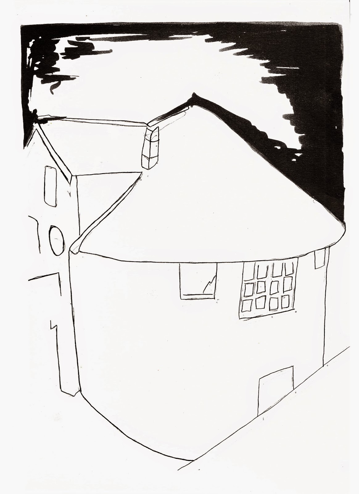
There was also one image which didn't make the final illustrations, the reason behind this was because the drawing was landscape and the rest were portrait and it wouldn't have fit right and I think 6 is a good amount for a series of illustrations. Below is the image not used. I suppose I could have used it when I decided not to use the borders but I didn't really like the drawing and it just didn't look too great.


Commercial Image Creation - Photoshop

The next stage of creating my illustrations was to assemble everything in Photoshop. My process for this is as follows:

1- Open sketches in Photoshop.

2- Go Select > Colour Range > Samples Colours > Select white blackground on image > Ok > Delete > Ctrl + D. This has now deleted the white around the line image so that only the line remains and the background is transparent.

3- Ctrl + L to open Levels to make the line drawing black.

4- Open the Brusho image that I would like to use and repeat step 2.

5- Change opacity of the Brusho layer so the line drawing doesn't get lost within the Brusho.

6- Re-size and position the 2 images to where I would like.

I repeated this process for all 7 images.


When the image was completed I saved it at 300dpi, in CMYK as a tiff file.

Commercial Image Creation - Brusho

As I previously blogged, I needed to come up with a colour pallet for my illustrations. After looking at the already existing issues of the magazine and thinking about my audience I have decided to go with a blue/red, green/yellow colour theme and to use Brusho for the backgrounds. I tried out a few different techniques with the Brusho. The first did not work so well as the colour was too strong and the Brusho powder had clumped on top of the image and it did not look good at all. This technique was wetting the page with water and then sprinkling the Brusho on the top. You can see below how this turned out.


After the first technique failed I took a different approach. I sprinkled the Brusho colours onto the page first and then used a sponge to squeeze water on top of the powder. This created large beads of water on the page which I then soaked back up with the sponge leaving only a light patch of colour on the page. This technique worked much better because I had a little bit more control and the colour and shape came out really well and I think they will be perfect to use in my illustrations.


Commercial Image Creation - Sketches

The first stage of creating the series of illustrations was to sketch the cafes. Whilst visiting York I did some reportage drawing of the cafes using a pencil and an Aqua Ink Molotow pen to create borders. I chose to put borders on my images because i used them in previous projects and I really liked their effect. I may not keep the border in my final illustrations but for the mean time it's just a development stage. Once I had done some sketches I re-drew the images but this time I made the lines more perfect and accurate. I also drew a version with the order and without the border for development purposes. 

I scanned my sketches into Photoshop and cleaned up the drawings and made the line darker. Before scanning the sketches I should have gone over the line with a black fine liner but I didn't and this would have made it so much easier. But with the use of Photoshop I was able to make the line black. 


Commercial Image Creation - Initial Idea

My first idea was to do an ink line drawing of each cafe and the use watercolour as a way of making the image come alive, in the style of Sunga Park. Then I was going to create a background with napkins, menus and images from the visits but this didn't exactly go to plan. I was not able to collect the materials I needed to create this so I had to think of a different idea. 

I encountered a problem when coming up with ideas as the client that this brief was written by failed to send me the mood board required to complete the images. This mood board would have included ideas, images and colour pallets which the client would have liked to have been incorporated into the series of images. Due to this problem I have had to come up with the idea and colour pallet entirely by myself, this is just a taster of what could happen when I am getting jobs from clients in the future.

My idea now is to still draw the cafes using ink and to use some kind of water colour background but the colour pallet is still yet to be determined. As the images are for a magazine I thought that maybe the colours should be loud and eye catching and after looking at previous One & Another magazines I have noticed that blues and greens are used quite a bit. The audience of this magazine is mostly teens and young adults so I think making the images quite bold and exciting will be aesthetically pleasing to my audience. 


Commercial Image Creation - York Cafes

Whilst in York I visited quite a few cafes. When looking at the cafes I took photographs to work from and also did a few reportage sketches whilst there. In total I visited 7 cafes from around York for my project. The cafes I visited were; Cafe Concerto, Coffee Culture, Me and Mrs Fisher, The Hairy Fig, The Hungry Artist, Bettys Cafe and Tea Rooms and The Perky Peacock. I will talk about a few below.

Cafe Concerto 

Cafe Concerto is a very unique and independent cafe. It is based around music, as the name states, and even has an apartment above for up to 5 guests called The Music House Apartment. I was interested in this cafe because of the decor. The plates etc. that are used in the cafe have sheet music printed around the edges which I think gives the place a really nice touch. There is also sheet music plastered up on the walls which I really liked as it gave the cafe character.


Me and Mrs Fisher

Me and Mrs Fisher is a cafe of crafts and cakes. It sells home made bakery and craft items and even has workshops available for people of the public to take part in. I think this cafe is really unique and what caught my eye firstly was the logo of the cafe, the 3 stacked cups is a very cute little illustration and it reminds me a lot of Tim Burtons work. 


The Hairy Fig

The Hairy Fig is a small Deli situated in York and it is packed full of produce from York, Yorkshire and Europe. Unlike most cafes it sells Spanish, Italian, French and Mexican foods with a wide range of balsamic vinegars. What caught my attention about this cafe was the name, I knew as soon as I heard it that it would be an interesting cafe.


The Hungry Artist 

The Hungry Artist caught my attention because inside and upstairs it had a little art gallery. There are paintings on the wall leading upstairs and lots of objects like mannequins and painted tables which I thought was a really nice touch to the cafe. There was space upstairs in the gallery to sit and eat and drink and it was very peaceful. The artwork is created by local artists and artists from all around the world and are also available for purchase at affordable prices. 


The Perky Peacock

The Perky Peacock first caught my attention because of the unique building shape, there is something very artists about the architecture that I just had to look into it. Outside of the cafe there are little table with jars of flowers on the top which just give the cafe a nice welcoming feel.