Friday 28 November 2014

Commercial Image Creation - I visited York ... Twice

I went on 2 visits to York to check out the cafes in the area and whilst there I took a look inside a few and took pictures of the buildings and done a few reportage sketches. I am going to draw more from the images I took to develop an idea which I have came up with. I am still waiting on the mood board from One & Another but once I have that I will have a better understanding of what is being asked of me and therefore I will feel more confident about developing this idea I have had now for a few weeks. 

The idea that I have in mind is to do a series of images where I will create an illustration of a cafe itself with inspiration from Sunga Park and then add in a background using images etc that I have taken whilst on the visit in a collage form. I haven't worked with collage very much before so I think this might be a new exciting change and the effect could be really nice. My brief is to create illustrations that represent the cafe culture of York and I thought what better way to present it than to use images of the cafes etc. I visited around 8 - 10 different cafes and after a little more research I will choose which cafes I would like to use for my illustrations. 


Tuesday 25 November 2014

Commercial Image Creation - Cafe Culture in York

York is a historic city situated in North Yorkshire, England and is the traditional county town of Yorkshire which is where York gets it's name. The city of York offers a lot of historic attractions including York Minister and the variety of cultural and sporting activities makes it a popular tourist destination. Since 1997 York has held a Festival of Food and Drink each September. The festival is held to spotlight the food culture in York and North Yorkshire by promoting the local food production. The festivals brings over 150,000  visitors from all of the country to York over a ten day span. One of the most well known local food products is York ham. It is a mild flavoured ham which is a delicate pink in colour and it is traditionally served with Madeira Sauce. Accodring to Folklore the oak construction for the York Minister provided the sawdust to smoke the ham. The birth place of the original York Ham is Robert Burrow Atkinson's butchery shop located in Blossom Street and is why the premises became famous. In St Helen's Square of York there is the York branch of Betty's Cafe Tea Rooms and the founder of the Tea Rooms was Frederick Belmont. He traveled on the maiden voyage of the Queen Mary in 1936 and he was so impressed by the appearance of the ship he employed the designers of the Queen Mary to turn a neglected furnature store into an elegant cafe. War broke out a few years after Betty's was opened and the basement 'Betty's Bar' became the favourite place of a lot of airmen around York. 'Betty's Mirror', which many airmen engraved there signatures on, remains on display in the cafe today as a tribute. 

There are lots of Cafes situated around York and my brief is to create a series of illustrations which represent the culture around York cafes. For my next stage of research I am going to go on a visit to York and look at the cafes, inside and out, and sketch some images, take some photographs and pick up any leaflets or menus I find there.

Wednesday 19 November 2014

Commercial Image Creation - The Underground Music Scene

"Un•der•ground (un’der ground’), n., adj. 

A genre in music and other forms of media intended for an elite audience, that is often characterised by it's high levels of originality and experimentation, and does not conform to typical standards, trends, or hypes as set by the popular mainstream media."


- Music that isn't found on the TV or big Radio stations
- Concerts aren't in stadiums or arenas 
- Not found in chain record stores, more than likely will be found at Tower Records
- Released on 7" vinyls rather than CD's
- Not featured in magazines such as Kerrang! or Rolling Stone
- Music isn't recorded in a fancy studio

http://www.urbandictionary.com/define.php?term=Underground+Music

Underground music is non commercial / non popular music. For music to be classified as underground it has to not be part of the corporate label music scene. 

http://www.newundergroundmusic.com/what-is-underground-music/


This website contains a lot of underground music bands: http://www.undergroundmusic.fm/trending

Basically any song which is not being legally commercialised is considered Underground. This music usually has freedom of creative expression unlike commercial music and relates to sincerity and intimacy. The Underground Music Scene also has an appreciation for artistic individuality as opposed to mainstream trends. Most types of Underground music are completely hidden but recordings or performances are still around for people to get hold of. The majority of Underground Music genres did not leave the non-mainstream scene such as hardcore punk band Discharge. However, some styles became mainstream over time such as the Underground Hip-Hop style of the 1980's. Cultural studies experts believe that there is no longer an 'Underground' because the internet has made what was underground music available for everyone at the click of a button meaning Underground Music is easier to distribute and access. 

'... now transmitted laterally and collaboratively via the internet. You once had a series of gatekeepers in the adoption of a trend: the innovator, the early adopter, the late adopter, the early mainstream, the late mainstream, and finally the conservative. But now it goes straight from the innovator to the mainstream.' - Martin Raymond, The Independent.

The term 'Underground Music' has recently been defined by any musicians who avoid mainstream commercial music industries but was formerly applied to various art movements such as the psychedelic music movement of the 1960's. Frank Zappa defines the Underground Music Scene as 'Mainstream comes to you, but you have to go to the underground.'

In the 1960's 'Underground' was associated with the counterculture of the young hippies which dropped out of college whilst in modern Popular Music 'Underground' refers to performers and bands that are signed to small independent record labels. In other music styles 'Underground' is used to state that the music is illegal or controversial, for example the early 1990's death metal bands such as Cannibal Corpse. Black metal is part of Underground Music and are well known for their association with The Occult, murders, church burning and their anti-christian views. Because of it's extreme nature, extreme metal is considered underground music.
There are 3 common misconceptions about the 'underground' and they are that; it refers only to the rave / electronic scene, that it can be described with the definition of 'anything which is not mainstream. and that the Underground Music Scene is kept a secret. - Shlomo Sher - Philosophy For Artists. 

UK Underground
The British Underground Scene developed in the mid 1960's and was linked to the hippie subculture of the USA. The movement generated it's own magazines, bands, newspapers and alternative lifestyle which was associated with cannabis and LSD use. The artists in the underground Movement were influences by 1950's Beatnik Beat generation writers such as William Burroughs and Allen Ginsberg. The underground movement was symbolised by the use of drugs and these drugs varied and most names and effects were unknown. 


Tuesday 18 November 2014

Commercial Image Creation - Sunga Park

Sunga Park is an artist / illustrator from South Korea and he has worked as many professions and for many companies. He has done cell animation, web design, character design, pixcel animation, flash animation, editorial design, graphic design and illustration and has worked for companies such as Liberty Magazine, Intouch Solutions, Garmin, Mojeh Magazine. Sunga Park does amazing watercolour paintings that blow my mind. They are so effective and they are very well planned out and eyecatching. I like his use of detail within the large areas of colour. His technique is amazing and I love him people drawings just as much as his architecture. 

Video showing Sunga Park's watercolour technique : http://vimeo.com/106736353


Sunga Park - Behance
Sunga Park - Flickr


Commercial Image Creation - Julia Sverchuk

Julia Sverchuk is an artist and illustrator from Moscow who currently lives and works in New York. She graduated from Parsons the New School for Design with BFA in Illustration and she works as a digital design director and exhibits her work and participates in Urban Sketchers global symposiums. She is mostly a reportage artist and draws on paper and with iPhones / iPads. 


I looked at her work because she is a reportage artist and that's what I am researching for my project at the moment. Her line work is amazing and really inspiring. I like the techniques and media she uses, looking at her images I can see she uses ink and graphite and I think the weight of her lines bring movement and dimension to her illustrations. I think her people drawings are really nice also, they show character which I think it really important in people illustrations.


Commercial Image Creation - Veronica Lawlor

Veronica Lawlor is best known for her reportage drawings that have led her around the world. She has created work for Brooks Brothers 185th anniversary campaign, 3M Corporation and the Hyatt hotel chain. She was the only artist to document the 9/11 attacks on the World Trade Centre and the full series of drawings are published in the book 'September 11, 2001: Words and Pictures.' Her work has appeared in lots of publications and it was been exhibited in Washington DC, Metropolitan Museum of Art, the Puck Gallery, Gallery 1482, the Society of Illustrators, the Rx Club and the Ellis Island Museum of Immigration. Studio 1482 has 7 members with the goal to communicate visually in new, unique and exciting ways. All members work both individually and together as a group and the studio is based on reportage. www.studio1482.com


I really like Veronicas use of line as it is rather loose but still has a solid structure and I think the varying of thickness of line gives the illustrations a really nice effect. I also really like how she only uses colour in big bursts on her images and it brings out the line a lot. I am looking at reportage artists because for my brief I am going to go to York and do some reportage drawings and of the people I see around and I will be looking at the cafes around the area too and I will take a lot of photographs for inspiration too. 


Friday 14 November 2014

Commercial Image Creation - One & Another

After a lot of thinking I have decided to go with the One & Another brief. I chose this one because I thought that it would best fit me and the way I work. Some of the briefs were pretty much fully open to anything and I didn't like the idea of that as I prefer to have a little structure to a brief. The rest of the briefs were based around subjects I'm not very interested in and I feel that if I had chosen one of them I wouldn't have enjoyed the brief as much as I could and my work throughout would not be of a high standard. 

My brief is to create a series of a minimum of 4 illustrations that reflects either Cafe Culture in York or The Underground Music Scene. One & Another will provide me with a mood board that reflects the tone of the article and quality of the visual realisation and if the work I produce is of industry standard and at the Editors discretion it will then go to print. 

I have started out by emailing the company asking for the mood board for the brief and my next step is to some research on Cafe Culture in York and The Underground Music Scene to determine which route I am going to go for. After which I will research the chosen path further. 

www.oneandother.com

http://archive.oneandother.com/magazine/

Friday 7 November 2014

Commercial Image Creation - It just got real.

We were given our new brief yesterday and it is both exciting and scary. The overall module is Commercial Briefs, a commercial brief is a brief where the designer / illustrator produces work for a commercial product. We have been given the choice of 8 commercial briefs, some are competitions that we have the chance to enter and hopefully win, some will get produced onto the said product and sold, there is a wide variety of briefs and they are all out there in the real world with real people. This is my first time taking part in something like this and I am excited to get to work and do the best I can. I am going to look at all 8 briefs and pick out a few which take my fancy, research into them and then hopefully I will have a better idea of which brief would be right for me. 

Brief 1 - Communication Arts Competition 

For this brief you can submit any work that has been produced from January 2014 through to January 2015. The winning entry will be selected by a nationally representative jury of distinguished designers, art directors and illustrators and it will be distributed worldwide in the Communication Arts Illustration Annual, in print and on iPad and featured on commarts.com. 

The winning entrant will receive a personalised Award of Excellence and certificates. 

It will cost $20 for a single print to to be entered and $40 for a print series. 

You are limited to five illustrations and you must be clear on which you want to be judges otherwise it will be disqualified from the competition. 

http://www.commarts.com/

Brief 2 -  Ernest Exhibition 

Ernest is a cafe / bar in Newcastle and this brief gives you the opportunity to have an exhibition in the cafe. The cafe is very cultural so there could be a lot to work on if I looked further into this. The exhibition must reflect the culture and ideas of Ernest and all presentation such as framing and production should be planned and the space must be visited so you are aware of the space you are working with. 

A minimum of 4 pieces must be produced and must be framed or otherwise suitably hung. 

You must also cover any costs of materials etc. and it must be prices suitably for a commercial audience, Ernest will also take a % of the commission from each sale. 

The winner will be chosen by the owner and creative director of Ernest.

http://www.weareernest.com/

Brief 3 - Liberty Open Call

Liberty Open Call is where you present your designs / products to a panel of expert judges to be in for a chance of having your products stocked in Liberty of London. It is a good opportunity to try your luck and even if you are unsuccessful you will receive guidance and advice from the experts you meet there. 

You must research and develop an illustrated product suitable for Liberty of London. 

The product must be high end and fit the heritage of the store. It must also be at a suitable selling price and delivered professionally. 

It can include, home wear, ceramics, scarves, stationary, prints, textiles and apparel (although it is not limited to these)

http://www.liberty.co.uk/

Brief 4 - Off Life Comic

This brief is to basically produce a comic for Off Life. Every one of their issues is made up of submissions from published artists, new talent and first timers. 

The brief is completely open but they would like to stay away from fantasy, superhero or sci-fi genres.

The story should be between one and four pages and after a certain amount of time (usually around 2 months) you are free to reprint your comic for your own personal reasons.

http://offlife.co.uk/

Brief 5 - One & Another 

This brief requires a series of 4 illustrations that reflects either Cafe Culture in York or The Underground Music Scene.

If this brief is chosen, One & Another will provide a mood board that reflects the tone of the visual realisation. 

If the work is produced of industry standard it will go to print. 

http://www.oneandother.com/

http://archive.oneandother.com/magazine/


Brief 6 - Two Penguins and a Puffin

A book cover must be designed for two of the following books; Carrie's War by Nina Bawden (Childrens Fiction), Freakonomics by Steven D. Levitt & Steven J. Dubner (Adult Non - Fiction) or Oranges Are Not The Only Fruit by Jeanette Winterson (Adult Fiction).

They are looking for a striking cover design that is well executed, with an imaginative concept and clearly places the book for it's market. The jacket of the book must work together as a whole but the front must be eye-catching within a crowded book shop and be able to work on screen for digital retailers. It must also have a strong use of typography. 


Brief 7 - Travelling Man

Create a comic or zine suitable for Travelling Man, Newcastle. 

The comic can be based around any subject and must be self published and if it at a high enough standard it will be critically assessed and considered to be stocked in their store. 


Brief 8 - Wylam Beer

This brief is to produce bottle labels and beer clips for a new Ale by Wylam Brewery. The inspiration around the designs is during the Roman Empire caraway seeds were blended with milk to form the 'Chara' of Julius Ceaser, eaten by the soldiers of Valerius as a battle booster. 

There is no house style as they are going through a branding change but the design must relate to the culture and market of the Wylam Brewery. 

This is also a competition where if you win your design will be printed onto the bottled and beer clips and will be sold in pubs etc.

Monday 3 November 2014

Non - Narrative Illustration - Conclusion

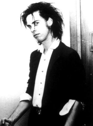
The aim of this project was to represent the music and artist of a chosen album through a self-initiated concept. From the list of albums I chose Nick Cave - Murder Ballads. I listened to around 5 of the albums that caught my attention but I decided on Nick Cave because I got really effective imagery from his songs. The album itself is exactly what it's called, it's an album of ballads based around the subject of murder. Nick Cave himself is a very strange man, I found. After researching him I found that he used to use heroin after he left art school but now he doesn't do drugs, smoke or drink. He is a gentle seductive man and this shows through in his music, his main subjects are love, death and violence and I think Murder Ballads shows all of these throughout the album and this also gives me a starting point of what my concept should be. Nick Cave is also very high maintenance, he loves himself and thinks he is the bee's knees. Before I started working on the project I had to think about my target market too, I decided on older teenagers and adults as his album is 18+ and therefore I could be a little more daring with the artwork.  To conclude, I chose Nick Cave because I liked the theme of the album, I enjoyed his songs even though they are rather strange and I also really adore Nick Cave, there is just something about him that makes me wish I knew him, he is such a character and I love how vain he is.


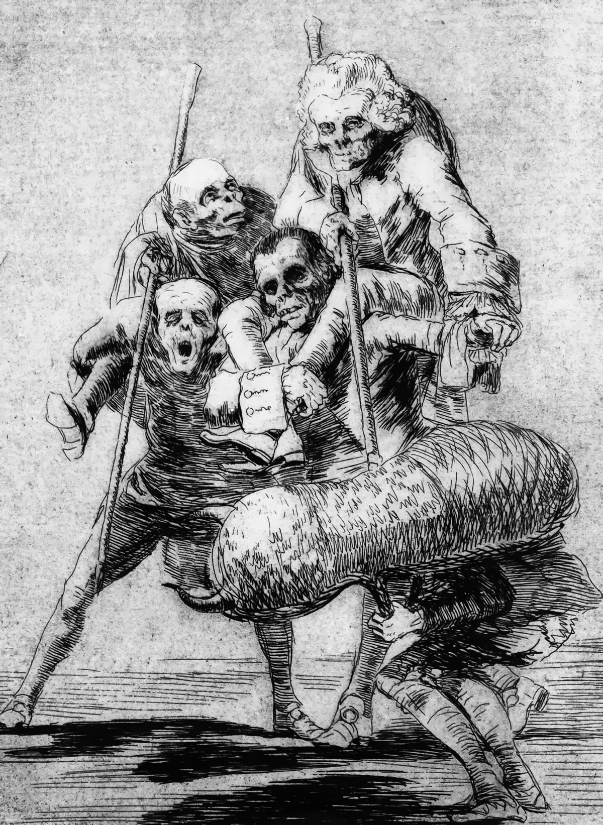
Throughout the project I looked at artists such as Goya, Alena Lavdovskaya and Vincent Castiglia. I looked at Goya because he has a series of prints that are a protest against the violence of war and they are basically very graphic images of people being killed at war etc. and I thought this was appropriate as my concept is murder / violence and I was thinking about printing my images using a technique like etching. Goyas influence didn't come out in my work, I decided not to use etching for my images but his influence may come in useful for another project in the future. I looked at a fashion illustrator called Alena Lavdovskaya who I found on pinterest and he work really influenced me. She uses a thick black line on her illustrations and then used tones of grey for shading etc and I think it is a really successful technique. This influence did come out in my work because I thought it was a really nice way of working and I think it looked rather good on my end product. I looked at Vincent Castiglia because he works in his own blood. With my concept being murder / violence I thought this would be appropriate. Even though I didn't paint with real blood in the end because I thought it would be a little distasteful I think he is a really unusual artist and the tones he gets in his work are amazing considering he uses blood. His work is also based around death which is a bonus. I think he will also come in useful for future projects if I ever do anything similar to this. I understand that some of the artists I looked at are rather out there and have content which not everyone will be happy with but I think because my target audience is older teenagers and adults I think it's okay to have thought about using them for influences.   


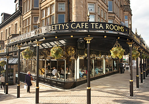
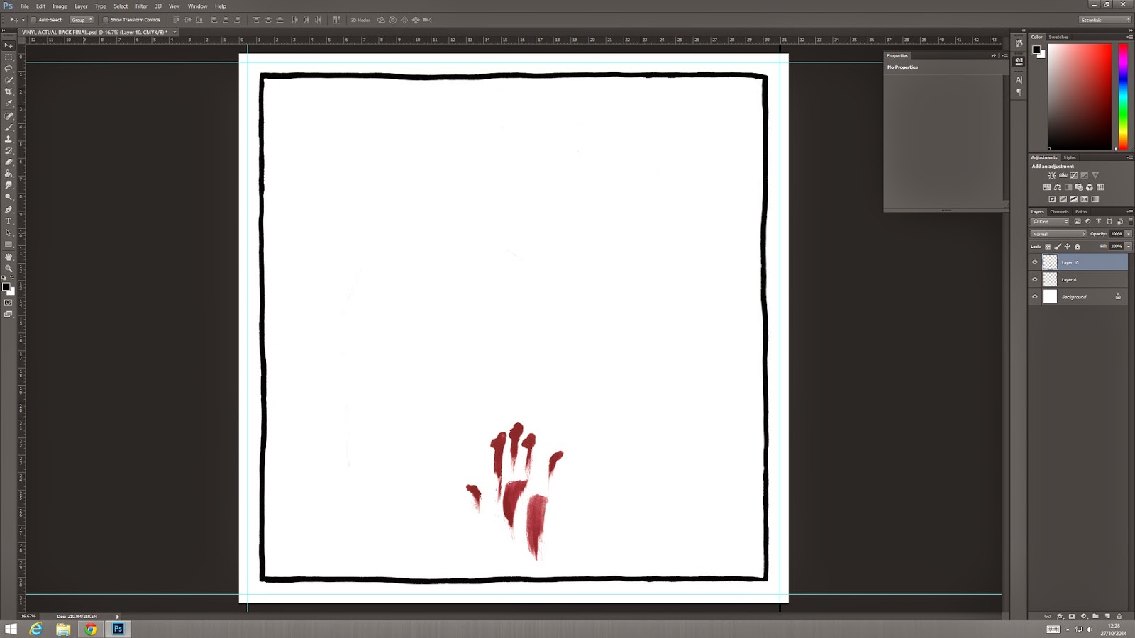
An advertising poster was one of things on the brief which we had to create. This was the first thing that I started to work on. I struggled at the beginning of the project because I hadn't drawn much in the holidays as I went through a stage where I couldn't seem to draw anything. I started out by sketching portraits of Nick Cave as I thought this would be a good place to start. I drew a lot of poses from existing photographs just to get some variation to develop from. I used pencils, inks and watercolours to experiment with different textures and tones. I really liked the effect the watercolours gave because I got a lot of different tones in the face and it was easy to create these effects just using water. For some more of the imagery for the poster I used red and black paint / ink to create some hand smudges and splats for added effect. I think these images fit my concept well because they represent violence and murder. I chose one of the drawings I liked best and then used black and red ink and paint to create a background and emotion. I think the red paint shows emotions as the colour suggests many moods, usually lust, love, anger etc. and that is the idea I was going for. The red paint was meant to represent blood but when I scanned in the image the red turned pink and that wasn't what I wanted at all. I added a border to my image too as it helps tie the whole image together and borders are on trend right now in the illustration community so I thought this would be an effective thing to do. The next stage was to put text onto the poster. This was a disaster. My initial idea was to use newspaper cuttings for the title but in a group crit I was told that this didn't work as it was very 'Sex Pistols' I agree with this but my actual reasoning behind it was that it was like a ransom note as my concept is murder. I looked at some fonts that were in Photoshop but I didn't think they flowed well with the style of the album and the artist so I decided to create my own. I was a little skeptical about writing my own font because I am not so good at typography and I have never done it before but when I did it, it worked rather well. I didn't want the text to look like a horror font because I think that would look tacky. I am not too sure on the idea I had when I wrote it, I just done what I felt was right. At this stage I was still unhappy with the colour of the 'blood'. I thought about using real blood instead of paint as this way I would achieve the correct colour but I thought that this would be a little unhygienic and offensive to some people so what I decided to do was make my own. I mixed together Maple Syrup, flour, water and brusho to make a blood colour. I painted over my original image with it and it worked really well. When I scanned it in it was still a bit pink but I changed the hue / saturation in Photoshop and I got the colour I needed. Before I started drawing things I looked at Nick Cave advertising posters that already exist just to see other artists take on it. The posters I looked at were very symbolic and the imagery fits my kind of audience too which inspired me. Overall I think my poster works well. I am advertising the Murder Ballads album and I have made that quite clear to the audience. I didn't think I needed to put 'Nick Cave and The Bad Seeds' on the poster because I think if people want the poster then they are going to know what 'Murder Ballads' is. I also think the imagery is suitable for my audience and concept, the colours suggest emotions and symbolises murder and violence and the overall imagery grabs your attention. The poster was to be printed A2 in size, to which I added a 5mm bleed. I printed out a few test posters on matte paper and cartridge paper, from feedback which I got from fellow class mates I decided that the cartridge paper works the best. Because the paper isn't white it kind of takes the harshness away from the rest of the poster. If this was to be mass produced it would be printed on actual poster paper where it is glossy,I unfortunately didn't have the funds to buy this kind of paper but that's what it would be printed on. I also have to submit the poster in a square format at 400px x 400px at 72dpi. 


I next went on to create my editorial illustration which could have been either an interview editorial or a fashion editorial. I chose to do the fashion editorial illustration as it is a new subject for me. I have never drawn a fashion illustration before and I never thought I'd be interested in it but it seems like a cool subject to try out. I looked online for male fashion images and catwalk images of men in suits basically because that is the kind of dress sense Nick Cave has so I thought it was appropriate. I had some guidance from a friend on how to draw the male form which helped a great deal as I'm not the best at drawing full body images. I got a lot of pose inspiration from catwalk images and I drew out a few which I liked. I then found a Fashion Illustrator who really inspired me. She is called Alena Lavdovskaya and I found her on Pinterest. Her work is really beautiful, she has a rather unique style and she influenced me a lot. She has this one style where she used a thick black line and then uses shades of grey for tones and detail which I thought gave a really nice effect which is why I used this technique in my illustration. I also looked at Company magazine because when they have fashion editorials in their magazine they sometimes have illustrations of the fashion rather than photographs which I thought was really nice. My idea was to draw Nick Cave as the model and have him in his usual clothing which I researched also. You may notice that he doesn't have a face, my reasoning for this is that his hair and eyebrows are enough to know that this is him and also his fans will definitely know that it is him. I think this illustration suits the artist because it shows his vain attitude which I really like and I was adamant to put that across in my illustration. I think the colours also represent his whole attitude. I think because this illustration isn't like normal fashion illustration with lots of colour and a lot of things going on, Nick Caves fans would be interested in this. I don't really think his fan base would be into pink frilly clothing. The size of the fashion illustration is 150mm x 150mm at 300dpi and when editing in Photoshop I added a 5mm bleed to this.


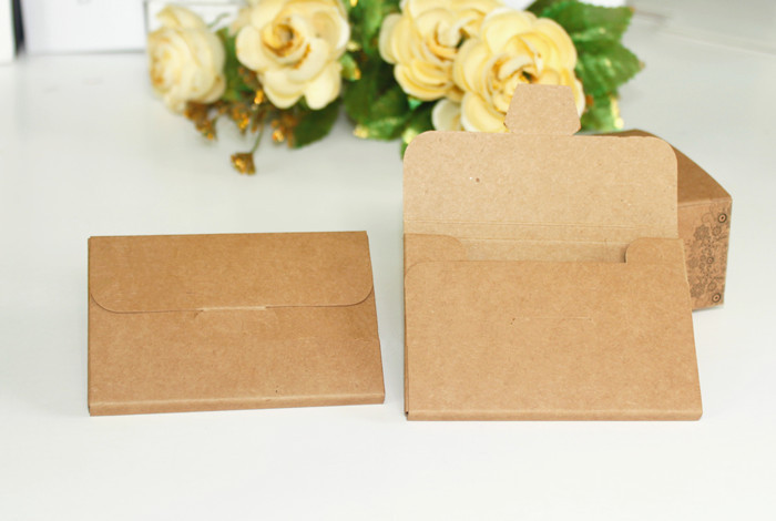
We had a choice between designing packaging for a CD or a 12" Vinyl cover. I chose vinyl because my target market is an older audience therefore I think they would prefer vinyl packaging rather than a CD. Before I started my drawings and planning for this I looked at already existing vinyl / CD covers and the art work on them. I looked at the likes of the Arctic Monkeys and Joy Division as their album art is rather straight forward and simplistic which I really liked. I also looked at some of Nick Caves vinyl covers and packaging and they seem rather simple too, there isn't much going on in them especially the album entitled "The Mercy Seat", I love the isolation of this album cover. I looked at packaging for vinyls too and there were some really interesting ones. Such as ones that had a book at the front and the vinyl was slotted in the back and there were some unusual ones such as concertina style packaging which I thought looked really cool. I decided that I would Just go ahead with a original style of vinyl sleeve, just a simple sleeve, no holes or anything just the slit at the side where the record will slide in. I decided this because I think it looks more old school and it would be cheaper to produce as very little material is needed and less ink would be used to print it as there will be less art work to print. The material it will be made of would be thick cartridge paper or cardboard which most vinyls are printed on. Moving on to the actual artwork for the album, it was a happy accident. What happened was, I scanned in my fashion editorial illustration and I was experimenting with composition and possible backgrounds and I made an image which I thought would look good on a vinyl cover. I set my canvas size to 12" and added a 5mm bleed on Photoshop and placed the fashion editorial on the left hand side. I chose the left hand side because you usually read things from left to right. I put in the red background and the border around the entire image. I used a border because it is kind of a theme throughout my project and it is trending in the illustration community right now. I then added the type face which I wrote out in a red Molotow 3mm pen and changed the colour to black on Photoshop so it fitted better with the overall image. I had a lot of problems with this process as I used a lot of type faces before hand that didn't quite work out as they did't fit right with the border etc. I overcame this problem by trying something new and doing my own typography which I wasn't too sure about doing. It worked rather well in the end and I think in future projects I will try this again if I ever have the same problem. For the back of the vinyl I added the black border around the entire square and added the track listing in black which I wrote myself and added the red hand I created at the beginning of the project. I had a problem with this part too as my original back cover had the quote "His red right hand" written in red as in one of the songs from Murder Ballads he states that the murderer quotes John Milton in his victims blood and this was the quote he wrote but I couldn't use it as His Red Right Hand is already a song by Nick Cave on another album so I had to change it to the track listing. I really like my vinyl art work, I think the composition works well and the image all works together as a whole which I was expecting not to happen. I printed my final vinyl onto matte paper but I think if I was to ever produce this then it would be on heavy duty paper or cardboard and it would be really cheap to make as there isn't much material. To print the vinyl to size I made a template that was 12" by 24" with a 5mm bleed for the images and a 2mm glue tab area to glue it together. Vinyls usually have an inlay as well and this can just be a sleeve made from tissue or thin tracing paper. I think the artwork suits my target audience as the imagery is 18+, I don't think younger people would be very interested in this unless they know and like the band or if their parents say it's okay. I didn't go too far with the imagery, I just touched upon the subject as I wouldn't like to put the selling of my product at risk if it was to be sold in shops. Overall I am happy with the way this has turned out and I like the style that has came out of it. I have never really worked like this before and I have learned a lot from this project. I also think that the style of the image suits the artist and the album. The fashion illustration shows Nick Caves vain attitude and I really like that.


I also had to produce some products based around the artist and album. We were given some ideas of products we could design such as apparel, ceramics, greetings cards and toys. We didn't have to choose one of these, we could come up with our own ideas. I started by researching Nick Cave products that already exist and there were quite a few nice products I found such as ceramics and postcards. I wanted to design a few different products just for variety. My first idea was to make a cup which has liquid around the outside. I thought about this a few times because these cups are usually targeted towards the younger generation, like children but then I changed the style of the cup a little and made it fit my audience. I made my freeze cup in the style of a beer jug as I thought that fitted my audience better than a normal cup / glass shape. I am not worried about this promoting alcohol because my audience is 18+ therefore there will be no risk of promoting under age drinking. My idea was to have the freeze liquid on the inside red, like blood, and have Nick Cave written on the top of the cup going all the way around in the font I used on the album cover. I think this fits my audience well as I said and I also think it represents the album and artist well also. It also fits quite well with my concept as the liquid inside resembles blood. I found Nick Cave postcards on Ebay and I thought they would be really cool to make. I used imagery from my poster and vinyl cover etc. and created some cool compositions. The postcards are based around the album also so I used the red hand etc. to make the connection. The last product I created was a skateboard deck. I posted a picture on Instagram of my project work and a skate company liked it so I checked out their profile and found that one of their members, Andrew Reynolds, had designed a Nick Cave deck also and this is where I got the idea from. I thought that if they can sell a Nick Cave deck then I could create a deck which would sell to my audience also. To me it was a plan that couldn't really fail. I bought a skateboard and sprayed it white and screen printed onto it. I really enjoyed screen printing and I hope to use it more in the future because I can make a large variety of things and I could make prints to hopefully sell. I think my skateboard fits with my concept and audience because it is using already existing imagery that I have created throughout the project. 


Overall I think I have tackled this project really well. I really enjoyed working with new techniques such as screen printing and I think I will again in the future. I believe my concept was a strong one and I think I worked around it consistently and all of my products etc. follow this concept. 

Non - Narrative Illustration - Product / Skateboard Deck / Screen Printing

After I looked at Baker Skateboards on Instagram and realised one of the members designed a Nick Cave skateboard deck. This gave me the idea to design one myself. My idea was to just have writing and a small image on the skateboard. Most decks have text in the centre and then an image, from what I've seen online and in skate shops.

I bought a small cheap skateboard from Argos and bought some Molotow Spray Acrylic in white and sprayed the whole underside of the deck white.


I then screen printed the 'Nick Cave and The Bad Seeds' logo which I have on my vinyl cover etc. 

Process - (I would have liked to have taken process photos but I didn't have a camera at the time) I printed my image out onto 2 pieces of acetate and taped them together. This is so that the black is the blackest I could possibly get it so it exposed properly. The next step was to prepare my screen for printing. I used a screen with 90 thread count which has small holes which allows me to get a fair bit of detail. I used the jet wash to wash the screen before putting on the emulsion. After putting it into the drying shelves to dry I then took it into the dark room to put on the emulsion. To do this I used a small trough filled with light exposing emulsion and dragged it up the screen so all of the screen was covered. I then put it in the drying shelves again. Once it was dry I took it back into the dark room and exposed it. To do this I took my positive and placed it face down on the exposure unit with the safe light on. I then positioned my screen on top and closed the uni lid. I then turned off the safe light and turned on the suction. The suction function is so that the positive it flush with the screen so when I expose it there is no extra exposed spaces that aren't needed. When the vacuum finished I turned on the exposure light until the timer was done and then turned off the vacuum and opened the lid of the exposure unit. I then had to jet wash the screen so the emulsion that was exposed drops out and I am left with the image I want to print. I then again put it in the drying shelves until it was ready to print. Once it was dry I taped up the areas that were exposed that I didn't want printing (e.g the edges of the screen) with gum tape. It was then ready to print. Because I was printing onto a skateboard deck I didn't use a clamp so our print technician, Jade, Held the skateboard as I used a squeegee to pull the ink down the screen to print it. After printing it was time to clean the screen. There are three chemicals to use on the screen to take off the emulsion and thoroughly clean the threads.  

Once the screen printing ink was dry I bought some fake blood and mixed it with printing medium to make sure it would stick to the skateboard surface and I had a friend who had bigger ahandsthan me, paint his hand and make a print onto the deck, over the text. He explained to me that placing the hand print over the text makes it pop more. I think it worked out really well and I am very pleased with it. I think that this would sell well because after researching Baker Skateboards and finding that someone already designed a Nick Cave board I knew it would be something that could sell to my audience,


Monday 27 October 2014

Non - Narrative Illustration - Postcard Packaging

Before I made my packaging for my postcards I looked at styles of packaging that already exists. I found lots of different interpretations of packaging and I really like the styles below. The first one looks to me like the cards are wrapped in tissue paper and then there is a paper wrap around the that to keep it together. I really like this one because it is very simple to make and it does it's job really well. Also, I find it very aesthetically pleasing. The second one is kind of a box that folds up. I think this would be cool if there were magnets inside the tabs and that's how the box stays shut. I also really like the pattern on this. The last one is more like an envelope with a tab which tucks into a slit and that's how it stays together. I like the paper material of this one, I think the brown works really well.  

Because the images on my postcards are rather loud I thought that going for a more simplistic packaging design would be the best direction. I took an A4 sheet of layout paper (tracing paper) and folded in all of the edges around the stack of postcards. I then stuck the paper down with some tape, just to note if I was producing these to sell I would use tape which is pretty much transparent and that peels off easy with no rips. I then printed out the title "Murder Ballads" onto an A3 sheet of cartridge paper and then cut out the title in a strip of paper that would wrap around the postcards, I also secured this together with a bit of tape. I really like how this looks, I think the layout paper works well because you can see the images through the paper and I also think the wrap around looks very professional. I didn't put any images on the packaging for the simple fact that my postcard images are really strong, in my opinion, and I didn't want to over power it. Some times less is more. I have created this in a landscape format but I could just as easily make a portrait format too. I believe this would be a really cheap and effective way of packaging my postcards as not much ink was used in the process and the paper I used was less than £1 in total. 


Non - Narrative Illustration - Vinyl Back Cover / Change

Last Friday we had another group crit and my work seemed to be getting some really positive feedback which was really nice because I feel like I've worked hard on making my work better since the last crit. Unfortunately there was one little thing that I did that was misleading. In the song Song of Joy it says that the murderer quotes John Milton in his victims blood and the quote in the song was his Red Right Hand and I thought that writing this on the back of the vinyl would be a cool idea but it turns out that His Red Right Hand is actually another song by Nick Cave and The Bad Seeds from a different album so there vinyl cover I designed would then be misleading to other people. What I decided to do instead was keep the little red hand at the bottom because I think it fits well and it fits well and I am also going to add the track listing to it. I will show the screenshots below but what I did was just wrote out the track listing in my sketchbook using a Molotow Acrylic Paint pen and then I scanned it in, changed the levels so the text as darker and then positioned it where I wanted it. I positioned the text central because the red hand is in the centre of the bottom and I just think it looks better than if it was at the side etc. I have printed out my vinyl cover again as I changed it and I printed it on A1 paper at 12" by 24" with a 5mm bleed all the way around and a 2cm glue tab area to stick it together. (last image)