As part of my brief I also have to create an advertising poster. I researched existing Nick Cave posters and I will insert the images and talk about them below.
1
2
3
These are my favourite Nick Cave posters that I found online. I really like the style of all of these. I like the use of colours in (1), the text font is also really effective and they layout works well also. (3) has really nice composition, it is very simple but I really like it, the colours are awesome as well, they fit together perfectly and the style of the image is very nice. (2) is my favourite I think. I like the big text and how there is a border around the content of the poster. The broken colour effect is really good as well, I think it gives the poster a really unique look and the style of the portrait is really effective. The last one is where I am going to get some inspiration from for my designs, (4) looks like it is advertising the Murder Ballads album and I really like the idea. There is a lot of symbolism and the painting is really cool. I'm not, however, too keen on the text font.
I have to create a product based around the album and artist I have chosen. I can choose from the following products; Apparel, Home Wear, Ceramics, Greetings Cards, Stationary and Toys. I have looked at Nick Cave existing merchandise and accessories and I will add pictures below and talk a bit more about them. Apparel Apparel is basically just 'clothing' and I have found a lot of merchandise t-shirts of Nick Cave. The two t-shirt below are form the same website (http://www.bathroomwall.co.uk/store/images/t-shirts/man-cave-White-optimized.png) And I really like the style of them. Stencil art work is really good for t-shirts as the design is very simple and in the long run it would cost less to mass produce as there won't be multiple colours which need to be printed.
The t-shirt below and to the left are probably some of the worst t-shirt designs I've ever came across. I hate t-shirts that only use a small amount of space on the front for a little low quality image. I don't think many people would but these and I definitely think they would pay a little extra for a more aesthetically pleasing item of clothing.
This is a hat/cap design from the same website as the two t-shirts above (http://www.cafepress.co.uk/+nick-cave+gifts) and I have the same feelings about this as I do about the shirts. I think the design is really bad and I wouldn't think about designing anything for this particular style of hat because it's not really in fashion anymore, I would choose a woolen hat or a beanie as they are more trendy now and more people would buy it. I think the style of beanie where there is a small embroidered logo on the front band of the hat looks really good and will sell more as these are becoming a trendy thing with older teenagers and young adults. http://shop.nickcave.com/nick-cave-the-bad-seeds/merchandise.html The website above shows a lot of simple merchandise similar to the first two t-shirts I spoke about. Most have limited colour, which as I said would be cheaper to produce but there are also a few t-shirts with vibrant colour which I think more people would go towards buying as they look more interesting and I will attach a picture of this below.
Homeware I also found some homeware merchandise of Nick Cave and I will talk about thee below.
This is an ornament which you can hang, probably made as a Christmas Tree decoration. I really like this design. I like the minimal colours and the stencil design. The colours work really well together also, I think the red makes the image pop and it works really well in a circle shape. These would be good to make a bunch of and sell them at Christmas time. A good way to make a bit extra money.
This is a sticker label that you can stick to beer bottles or any other object you wish. It is the same style as the image above therefore I really like the design. I don't think a sticker would be very expensive to produce so a more complicated design could also be used to create this. These could be good to mass produce and sell on a stall or internet shop.
This is a thermo flask and I don't like the design at all. I think it looks very unaesthetic and the image has been warped due to the shape of the flask. I think a better image could have been used for this but I also think a different product could have worked better, I don't know many people who would want to buy a Nick Cave flask.
This is my favourite home wear product I have seen. I think the design works really well and so does the composition. I like the white border around image, I think it looks very pop art like. I think a lot of people would buy this product because it good for decoration purposes for bedrooms / studios etc. This may be on the more pricey side to produce but I think a lot of people would purchase these. Ceramics Some Nick Cave designs have been produced onto ceramics, unfortunately I could only find mugs but design can basically be put onto anything ceramic.
I hate this. This is the kind of merchandise ceramics that I wonder why people would buy it. I find it unpleasant to look at and I think it has been designed really badly. I suppose that if someone was a huge fan of Nick Cave they would buy this just to say they have it but I don't think anyone would buy this because it's nice to look at. However, on the same website as the image above (http://www.cafepress.co.uk/+nick-cave+gifts) They also have these designs which I think are so much better. The patterns are really nicely designed and the colours work really well and they look awesome as a series of mugs which I think is great marketing because when I first seen them I thought about if I was to buy one I would probably get more than one as they look good in a set.
I couldn't find any Nick Cave stationary but it could be produced. The name of him or his album could be printed onto the side of a pen or pencil and onto a ruler. I think with this product I would be very limited as to what I could print onto because my target audience is older teenagers to adults, not many of them would want to buy stationary, in my opinion, they would want to buy other things like t-shirts and home wear.
Toys
I also don't think toys would be a good product either because I would associate toys with younger children and that is not my target audience therefore this product would not work.
I struggled at first to understand what fashion / interview editorial illustration was but with a little bit of guidance I think I now understand. My idea of what they are is an illustration of an object, product or person to accompany an article / interview in a magazine. I have decided to go for the fashion editorial illustration because it's not something I've ever thought about illustrating before so it could be a good challenge for me to try out. As I couldn't find any Nick Cave specific editorials I thought I would just research the term itself. I found some example of fashion illustration editorials in a magazine called Company. This magazine has a lot of illustrated images attached to their articles and I think this looks so good as part of a magazine spread. I will attach some photos below of the magazine. I also found a lot of fashion illustrations on Pinterest which I will link below too. I thought these images would be very helpful for me to understand fashion illustration and it shows many different styles of drawing which can give me some inspiration when I come to create my own illustration. http://www.pinterest.com/1auren/fashion-illustration-editorials/
This link is awesome for anyone interested in fashion illustration and for anyone on my course who has also chosen the fashion editorial.
Company Magazine
When I come to draw up my fashion editorial illustration I will look at the fashion of Nick Cave and existing illustrations of mens fashion. I think this is going to be a fun challenge for me and I hope I do it as well as I am hoping!
After researching 4 albums and looking into their songs and the stories behind them I have decided to go with Murder Ballads by Nick Cave. I have chosen this one because the stories behind the songs really drew me into the album and made me listen whilst the others I thought were not as strong. I like the idea of creating art work around the theme of murder, I think I will find this quite exciting and fun. I am willing to experiment with media quite a bit in this project as I already have a few ideas I would like to try out. I have also decided that my target audience will be 16+, the reason for this being that the album is branded with Parental Advisory so the album and therefore the artwork will only be suitable for people above 18 or 16 with parental consent. However other age restrictions may apply if people where to buy this album.
I have now researched more into the artist by looking at existing album arts, merchandise, posters etc. Just so I can have some idea of what is already out there and hopefully I will succeed in making my ideas just as good. Not all of the products listed below are specifically for the album Murder Ballads but I think researching his full selection of merchandise would be better than just a few products of one album.
CD / Vinyl Packaging
I think I am leaning towards creating the packaging for a vinyl record. I looked at already existing vinyls that Nick Cave has released and the can be seen below.
I really like the style of this vinyl cove. The colours are really simple yet very effective. I like the use of photography and the over exposed brick wall behind him and the text colour works really well with the image. I also really like the use of lower case letters in the album title, using I find this really annoying and unprofessional but I think it suits the style really well.
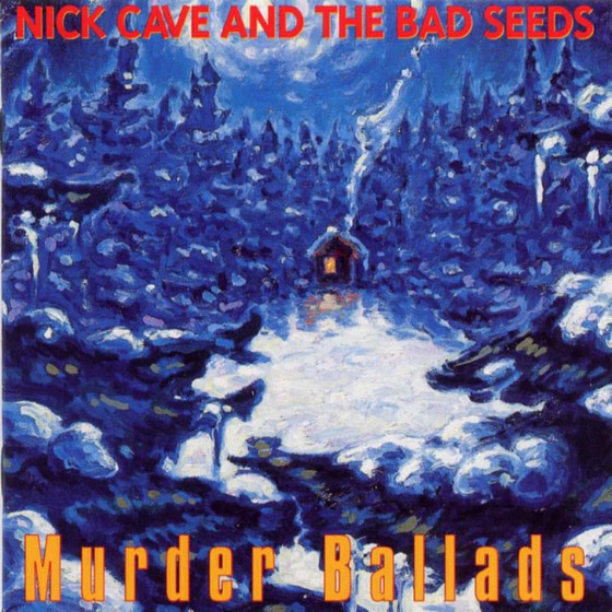
This is the vinyl cover for the album I have chosen, Murder Ballads. Like I previously said in my other post, I don't understand this artwork and I think it looks really unorganised and the font looks out of place. I don't like the use of the red text over the blue background, I don't think the colours go well so close together. I am hoping that I can come up with some ideas which I like the look of better than the original.
This is another vinyl from Nick Cave and I like this one a lot better than the last. I like the black background and the colourful painted flowers. I really like the texture of the flowers, it looks realistic and the contrast between the background and the bright flowers is really nice and it works really well. I like the use of the black background so I' thinking maybe that can be something I can take forward as inspiration for my vinyl packaging.
This cover is one of my favourites. I love artwork like this, the use of two opposite shades and the isolation of the image in the centre of the cover is really effective. There's a sense of emptiness and I really like that. I also really like the style of the vinyl record itself, the black centre circle looks really good against the white record. Also, white records are just plain beautiful anyway!
I looked at CD covers as well but they were obviously just the same artwork as the vinyl. (I will attach some photos). I think I will enjoy creating the packaging for a vinyl more than a CD because I have a small passion for vinyl, I love their size, sound and packaging. When it comes to me creating my vinyl packaging I will research different types of vinyl packaging, such as the simple sleeve or a book or something that unfolds, there are probably loads to look at and get inspiration from. I also thought that it would be a little more expensive to produce vinyl covers rather than CD covers considering the size difference but in my opinion it would be worth it.
Background on artist First Aid Kit are a Swedish Folk duo and they became known from YouTube when they covered Fleet Foxes ''Tiger Mountain Peasant Song'' this then spread their name across the internet. Their country style songs has achieved them world wide fame along with their harmonious singing. Stay Gold This album was released on June 6th 2014 and a Swedish TV interview states that this album is based around their own lives more than their other albums. To create a more fulfilling sounds to their album they have a 13 piece orchestra which they had never used before producing this and had always been limited to 3 people on stage. Lyrics My Silver Lining- This song is about searching for a reason to keep going and that good always comes with the bad. The duo stated in an interview that they wanted to create a song which was dark but also uplifting. The music also speaks to the listener. The use of violins and acoustic guitar brings out the beautiful voices of the duo wonderfully. http://www.azlyrics.com/lyrics/firstaidkit/mysilverlining.html http://www.pastemagazine.com/articles/2014/03/first-aid-kit-announces-new-album-stay-gold-releas.html http://thekey.xpn.org/2014/04/02/first-aid-kit-embark-on-a-quest-for-clarity-and-meaning-on-new-song-my-silver-lining/ Master Pretender- This song is about someone going through life thinking of herself as a strong person when in reality life is making her doubt herself. She is ''pretending'' her way through life and she is just trying to find a silver lining within everything. http://rock.genius.com/First-aid-kit-my-silver-lining-lyrics http://www.azlyrics.com/lyrics/firstaidkit/masterpretender.html Stay Gold - This song symbolises that nothing lasts forever and things will never be what they seem and you just have to take life as it comes. There will always bad times and good times, you just have to 'stay gold'. I like the story behind this song as it's emotional and understandable and luckily I get imagery also. http://rock.genius.com/First-aid-kit-stay-gold-lyrics http://www.azlyrics.com/lyrics/firstaidkit/staygold.html Cedar Lane- This song is about a girl who suffers from sleepless nights and she dwells on mistakes from the past. Her relationship is represented by a Cedar Tree as they are large and long living and this what she dreams one day it will be like. She wishes that they could forget all the bad stuff and focus on the things that matter but she knows deep down it's over but she wants them back. She made the wrong decision and she wishes she could just go back and change it. http://rock.genius.com/First-aid-kit-cedar-lane-lyrics http://www.azlyrics.com/lyrics/firstaidkit/cedarlane.html I am very fond of the artwork for the album cover as it is very indie and unique and I like the use of colours and how look washed out and the transparency of the images also give a really nice effect.
I have decided now that because not all of the songs on the albums were giving me visual spikes or sticking out from the rest from now on I will only write about the songs that are relevant, I am still going to research and listen to the whole album but only certain songs will make it into the post. This will also save time and reading for my viewers.
Background on Artist Kraftwerk are an electronic band from Germany, formed in 1970. The bands music is created with catchy tunes and they were one of the first musical groups to make electronic music popular. Their music had a lasting effect on many modern genres of music. The Observer said that no band since the Beatles has given so much to pop culture. Musical journalist Neil McCormick once stated that Kraftwerk might be the most influential group in pop history. Kraftwerk have highly influenced most electronic bands and even the likes of David Bowie. Kraftwerks fashion style and music style can be seen in music successes such as Ultravox, John Foxx, Human League, Visage and Soft Cell. They also influenced a range of music genres such as hip hop, house, and drum and bass. Trans Europe Express This album was recorded in 1976 in Germany and was released in March of 1977. The themes of the album was influenced by friends of the group who said that they should write songs about the Trans Europe Express to show the electronic style of music that Kraftwerk created. This album focuses on mechanized rhythms, minimalism and the occasional manipulated vocal sounds. Lyrics Most of Kraftwerks songs on this album have very little or no lyrics so what I will do it talk about the ones with lyrics and then the ones without. Hall of Mirrors- I listened to all of the songs and read the lyrics and this is the only song with actual lyrics. The rest are either instrumentals or have repetitive lyrics. The lyrics in this song address the way stars look at themselves in a looking glass. The group describe the song as ''auto-biographical'' which means it was written about the writers life. I think the key aspect of the songs on this album is the electronic music rather than the lyrics. When I hear the music I think of mechanical things like robots and trains and electronics. http://www.metrolyrics.com/hall-of-mirrors-lyrics-kraftwerk.html I will talk about the rest of the songs as a group as they are mostly instrumental. The music that Kraftwerk produce is very futuristic and electronic. The music makes me think of space, machinery, big metal vehicles, robots and other electronic things and the colour blue for some reason, I am not entirely sure why but when I listen to the album I just see metallic blues and silvers which is good imagery for if I decide to choose this band. The rest of the albums songs are called Europe Endless, Showroom Dummies, Trans Europe Express, Metal on Metal, Franz Schubert, and Endless Endless. All of these songs either has no lyrics or repetitive lyrics that I found irrelevant. Their lyrics can be found on sites such as A-Z Lyrics and Lyrics Freak. I am not sure about this album, I like the visuals that I receive from it but I am not sure on what I could create with it. I think I will put this album in my final few choices and I then make a decision. I really like the existing album art for this, it is very abstract and symbolic.
Nick Cave is a songwriter, musician, author, composer, screenwriter and a film actor from Australia. He was lead singer of a rock band called Nick Cave and the Bad Seeds, formed in 1983 and they were known for their influences and musical styles. He was also the front-man of the band The Birthday Party and also formed the group Grinderman. His music is well known for it's intense emotion and obsessions with religion, death, love and violence. Nick Cave was also a drug user, when he left art school he started using heroin.
Murder Ballads
Nick Cave and the Bad Seeds album, Murder Ballads, released on February 5th, 1996 was an album entirely relating to murder/crimes of passion. Murder Ballads was the bands biggest success commercially.
Lyrics
After reading through the song lyrics from the album this is what I got from the analysis -
Song of Joy-
After listening to this song I realised that the story is pretty self explanatory. He was away visiting a friend and someone intruded in his and his wifes home and murdered her and their 3 children. This song is really emotional and I got a lot of imagery from it. Can't say the imagery was very nice but it was something nice to work from if I chose this album.
What I got from these lyrics was that a man named Stagger Lee was kicked out by his wife and went to a bar named The Bucket of Blood. He had a little argument with the bartender and Stagger Lee shot him in the head four times and then a woman comes in who flirts with Stagger Lee and she invites him back to her place and when he gets there a man called Billy Dilly comes in and then there is a mention of homosexual activity between Billy Dilly and Stagger Lee but Stag proceeds to shoot him in the head. I also think this song is very self explanatory and it is very visual which I think is really good. In conclusion, Stagger Lee got dumped so decided to go on a killing spree.
In this song a man is seduced by a woman and he basically tells her that he has a woman waiting for him back home whom he loves more then her so she stabs him with a pen knife and he got thrown into a deep well. I didn't really get much imagery from this song. I think this has been a weak one with a weak story.
This song is very cryptic in my opinion, what I get from this is that the man finds a woman and is in love with her but one day she just disappears and is apparently buried under the sands. I am finding it really hard to find information about the songs on this album so I am just going of my analysis alone and have no actual song facts. This song is also not so visual.
I really like the imagery I got from this song, I felt really empty and cold. I think this one about him meeting a woman and taking her to the place where the roses grow and he kills her because "all beauty must die". I am starting to think that this album would be really good to do art work for, the imagery and emotions are really strong.
This song is based on the story The Jupiter Tree by Peter Straub which is a beautiful, tragic story which is portrayed in Nick Caves song. In the majority of his songs you can see the darkness that goes into them, along with rage which is caused by the emotional damage inflicted by molestation. I get a lot of imagery from this song, like a lot of Nicks music, there is a very strong story to work from there too.
This song is also pretty self explanatory. A woman who grew up in a less fortunate family wanted to explore the sea and she went to do so and she met a strange man, who she did not invite back to her hotel room, he killed her. Cuffed to the bed, rag in her mouth and a bullet in her head. I really like the story behind this, it is so innocent but gets real and dark very quickly.
I didn't like this song because it is basically about a group of miners gang raping a woman ''and poured their pistols dry''. It's fair to say that there is a lot of strong imagery in this song but it's a little twisted for my liking. Judging from the end of the song where it says ''population now 28'' I think she may have gotten revenge and killed the 20 miners that attacked her.
In this song a man walks into a bar (no joke intended;p), orders a drink, sits down and then pulls out a gun.Soon after the bar is a 'bloodbath' and he contemplates killing himself as the place is surrounded by police. Nick Cave said in an interview that he loves this character, he thinks he is trying to do everything which he thinks is right when in reality he is a ''fool with a gun''. I really like the story of this song, I think it is very visual and poetic and it really speaks to me. I understand it a lot and it's very moving.
This was originally written and performed by Bob Dylan. I feel that this song is more of a poem than a song and I really like it. I feel like it is about suicide, that someone is contemplating it but they are constantly being told that when you die it's still not over. Nick Cave once said that because this song has no death in it it's kind of a funny ending to the album.
The art work for this album confuses me a little. It is a snowy night painting with a little cottage and I can see no connection between this and the songs on the album, unless I missed something...
After going through all of the lyrics to this album I have came to the conclusion that most of the songs have deep meanings and very strong visual spikes which I think is a really good thing because if I choose to go with this album then I will have a lot of imagery to work from. This album could be a very good choice and I will still consider choosing it.
(I apologise for the long text post, there will probably be a lot of these for the next few days as my plan for now is to research, research, research!)
Patti Smith is a singer-songwriter from Chicago, born December 30th, 1946 and is also a poet and visual artist. She was a highly influential component of the Punk Rock movement with the release of her album 'Horses'. This album and Patti Smith herself have also had a massive influence on Michael Stipe of R.E.M; Listening to Horse when he was a teenager was what inspired him to start a band. She has also inspired many other artists including Shirley Manson, Sonic Youth, U2, Courtney Love, Madonna, KT Tunstall and Pussy Riot. Horses Patti Smiths 1975 album, Horses; released on December 13th, was a huge success commercially and critically due to it's meaningful lyrics and 'skillful wordplay'. Considered as an early Punk Rock album, Horses is one of the best albums of all time. Even though the album was classified as Punk Rock, ''Birdland'' leaned more towards Jazz. The lyrics to this song were based on A Book Of Dreams. The songs ''Redondo Beach'', ''Free Money'' and ''Kimberly'' were all inspired by moments in which Patti Smith had had with her family members. However, the songs ''Break it up'' and ''Elegie'' were written about Patti's idols. The cover for the album was photographed by Robert Mapplethorpe at a penthouse in Greenwich Village Lyrics After reading through the song lyrics from the album this is what I got from the analysis - Gloria - When reading through the lyrics to this song I got the impression that the person whose POV we're listening from is at a party and see's a girl that they find physically attractive and they end up taking her home and having sex with her, and if you haven't guessed, her name is Gloria. And it is also said that this is a 'Sapphic Love Song' meaning a love song with lesbian references. Whilst listening to the song the tone of the artists voice and sound of the music sounds really sexual and fits the lyrics really well. http://artists.letssingit.com/patti-smith-lyrics-gloria-qq9lx6w#axzz3E3bmuDVl Redondo Beach - When listening to this song I got the impression that it was written about one of her family members (earlier stated that this song was written about a moment she shared with a family member) which she had maybe fallen out with judging from the line "we just had the quarrel that sent you away'' and then after researching it I found that she had a fight with her sister and she wrote that song about that moment in her life. At the end of the song it states that the sister dies, not too sure if she kills herself or it's an accident as I couldn't find that information. http://artists.letssingit.com/patti-smith-lyrics-redondo-beach-c7hzxb4#axzz3E3bmuDVl Birdland - Birdland was written when Patti Smith read a book called Book of Dreams by Peter Reich and she states that there is a passage in the book which tells you about when the author was little and his father died and he would go into the fields hoping his father would come and take him away in a UFO and one day he saw his father in a UFO and air force planes came and chased the UFO away and he was crying for his father to come back for him. She found this passage really moving which is why she wrote this song about it. I think there is a lot of imagery portrayed through this song. http://artists.letssingit.com/patti-smith-lyrics-birdland-jc1tpmz#axzz3E3bmuDVl http://www.oceanstar.com/patti/intervus/7512craw.htm Free Money - This song was also written about a memory from her family as well as Redondo Beach. This song was written about how her parents had 4 children at the end of WWII and they had very high medical bills and this song was inspired by her and her siblings growing up into a poor family. She stated in an interview that the song was written for her mother as she always dreamed about winning the lottery but never bought a lottery ticket. I feel that Patti's songs which she writes about her family are very moving and they set a really sad and sympathetic mood and I think that is something you can portray through art really well. http://www.oceanstar.com/patti/intervus/7512craw.htm http://artists.letssingit.com/patti-smith-lyrics-free-money-lg2crg2 Kimberly - Kimberly was yet another song written about a family member, this one being her sister. This song gives the listener an insight of their childhood living situations by singing about their housing developments and that their home was on a swamp and that when her sister was a baby she was holding her outside watching a barn burn which had been hit by lightening over the road from where they lived. http://www.oceanstar.com/patti/intervus/7512craw.htm http://artists.letssingit.com/patti-smith-lyrics-kimberly-417l1rr Break it Up - This song started when she had a dream about Jim Morrison (lead singer of The Doors). He was laying on a marble slab and he had wings made of stone which imprisoned him. And she stood there screaming 'Break it up' and his wings broke and he was free. This song has amazing imagery and I would love to draw something as a single CD cover, I think it would look so cool. http://www.oceanstar.com/patti/intervus/7512craw.htm http://artists.letssingit.com/patti-smith-lyrics-break-it-up-k3n32bz Land - The song Land was written as a paean to Jimi Hendrix (A paean being a song of praise or triumph) but that is not what you get from the lyrics to the song. It is said that the song goes from a strange, sexually-charged encounter between two bad boys to a celebration of teenage dance crazes. http://www.theguardian.com/music/2005/may/22/popandrock1 http://artists.letssingit.com/patti-smith-lyrics-land-9j8p4nf Elegie - This song was wrote as a requiem for Jimi Hendrix and it was recorded on September 18th 1975 which was the anniversary of his death. The last lines of the song being 'I think it's sad, just too sad, that all our friends can't be with us today' were from the song 1983 (A Merman) by Jimi Hendrix and Patti Smith said in an interview that she didn't think Jimi would mind. This song is also part of the select few that were written about her idols. http://www.theguardian.com/music/2005/may/22/popandrock1 http://artists.letssingit.com/patti-smith-lyrics-elegie-q879819#axzz3E3bmuDVl After reading and listening to the entire album I have came to the conclusion that Patti Smith's lyrics all have some meaning to them and I think this could be a really good decision as there are loads of imagery spikes within her songs and she is very good at setting a mood within her music using tones and sounds which can be really helpful when it comes to creating artwork from only looking at an album of songs. I also really like how the album art is simply a photograph of Patti Smith as I think this is will make it easier for me to come up with my own designs as there isn't anything to accidentally work from. Therefore it will all be my own ideas and designs. (Apologies for the long text post, there will probably be a lot of these for the next few days as my plan for now it to research, research, research!) http://www.biography.com/people/patti-smith-9487150
Today our new brief was introduced to us and it seems like a very exciting project!
The brief is non-narrative and the aim of it is to research and choose an album from the list provided and create a concept by listening to the music, reading the lyrics and looking into the meaning of the album and the background of the musical artist. Once the concept has been thought of and I have researched the album and artist it is then time for me to develop drawings for my chosen album and produce a CD or Vinyl packaging, a Fashion or Interview Editorial, a product from the following; Apparel, Home wear, Ceramics, Greetings cards, Stationary or a Toy and lastly an Advertising Poster.
I narrowed the list of albums provided down to some choices which I think might be god enough to choose. My plan for the next few days is to analyse and research the song lyrics and the background of the artist and to listen through the albums.
Let's go! Notes for me: -Digital Journal -Professionally presented packaging for a CD or 12" Vinyl -An illustration presented digitally. Image size 150mm x 150mm at 300dpi -Product - Professionally and appropriately presented -Poster - Printed A2 and digitally submitted to scale 400 x 400px - 72dpi -Written final conclusion, and description, or your overriding concept