Thursday, 14 November 2013

Digital Manipulation: Turtle

My third image I created is of a turtle that i previously drew and scanned in and like the others I traced the outline and then deleted the image so I was left with the black outline.  
I kept forgetting to screen shot but for this I basically used the brush tools to create the shell texture, which I don't think is very good, and to created the scales. 
I wanted to add a texture to the leg and neck so I used the same filter as the elephant and i think it looks a bit better.  
When I had finished I added a grass background using a grass like brush tool and I really like the effect it gives but I am not too keen on the whole image itself. 

Digital Manipulation: Elephant

This is the second image that I drew and to do this I scanned in an image of an elephant that I already drew and then used the brush tool to trace over the image. I forgot to take screen shots before this point but I used the brush tool and the mixer brush tool to create the wrinkles and detail on the elephants face and ears. I like how the lines turned out but I think it is too much detail. I think it would have looked better if there were less lines. I added a mosaic filter to the image to add texture to the skin. Also I don't really like the ears because they don't actually look like they are attached to his head. 
Next I aded a background using the brush and mixer brush tools. I used the colour green because I think the colour works really well with the grey of the elephant. 
When I finished and looked at the final image I didn't really like it but I used the rubber tool and rubbed out some parts of the filter just to break it up and little and I think it looks a little bit better. 


Digital Manipulation: Octopus

This is the first digital image I created of an octopus and to do this I opened a sketch I drew of an octopus and traced the outline. I then removed the scanned image so I was just left with the black outline 
I stuck to one shape brush on this image because it was my first time using a Cintiq so I just wanted to keep it simple for my first try. I used a light orange as a base colour so that I could work over the top with darker colours. I really like the tones I have managed to create with the colours I used and I also like some of the sketchy lines around the head area.
When I finished colouring the octopus I wanted to add a background so  I created a new layer and put it behind the octopus and used a range of blues and used the 'mixer brush' tool to merge the colours together. I really like ow this has turned out, especially because it was my first time drawing graphically.

Wednesday, 13 November 2013

Digital Manipulation Research: Alexander Jansson

http://www.alexanderjansson.com/
http://alexanderjansson.deviantart.com/

Quick Links:
Illustrations
Animation
Characters
Blog
Biography

I really like the animals that Alexander Jansson draws in his work. I think they are really impressive and I like the techniques he uses. His drawings look realistic yet cartoon-like and I think it works really well.


Digital Manipulation Research

http://misanthropics.deviantart.com (first image)


I am not entirely sure of the artists of these images but when I searched for digital animal drawings I found this really interesting style of digital drawing and I was very inspired by it. I would like to try this for myself and see how it turns out.

Digital Manipulation Research

For my digital project I decided I would like to base my images around animals. I enjoyed the animals and creatures project beforehand and I am really interested in drawing digital animals.

http://junryou-na-kokoro.deviantart.com
I really like the colours and techniques used in this image.
I prefer realistic digital drawings but I thought this was really
unusual and inspiring.


http://komodoempire.deviantart.com
I like this because it is quite a realistic drawing
and I am inspired by the use of textured
lines to create the fur.


http://elconsigliere.deviantart.com
I really like the colours and textured lines
used in this drawing. I think they make
the image look realistic and the background
also adds to the effect.

Sunday, 10 November 2013

Installation: People and Characters

This project was based around people and characters and the aim was to draw interesting people that we seen around the local area and we even had a banjo player, a guitar player/singer and circus performers come into the college so we could draw them from life. I think that this was a great opportunity and really opened our minds to all types of people that are out there. (Circus Performers)
We all then chose people who we wanted to work in collaboration with and started thinking about what ideas we could come up with to portray the people and characters around Hartlepool in the form of an installation. Me and my group decided that we would focus on the aspect of body modification as we were all interested in tattoo art and modifying the body. The brief states that the work needed for this project was 5 drawings, 5 prints and obviously the installation itself. 
For my part in the project I decided I wanted to produce 3 A1 prints showing a range of body modifications in both genders. I started off by doing 3 sketchbooks full of drawings of people and the sketches from research on my chosen subject focus. The images I decided to create were 2 male heads and 1 female body. I used my life drawing sketches for reference and I used dry point etching to print the images. Once I had printed the drawings I used water colours to paint just the tattoos. I decided to do this because I wanted to create a contrast between the figure and the modifications. Next I scanned the image into Photoshop and with the help of one of my group members we edited the image contract and colour to make them stand out from the page a lot more. I then saved them in a very high resolution and had them printed A1 size. I was worried that when I blew up the images they would lose detail but I don't think the outcome was too bad and I really like how it looked. I also drew onto the wall under my prints using black ink just to carry the drawings on and also to create a starting point for Alan Vest to contribute with his string to tie everything together.
As this was a collaborative brief I will document the process of my group members. Thomas Serginson created 2 A1 prints of female heads in his own preferred style of bio-mechanical imagery. They were both hand drawn and rendered by Tom and then digitally enhanced and an added background on Photoshop. We all thought that it would work well if we connected with the next groups painting so we spoke to Sophie and her group and continued the hair of one of the females into their sky which I think brought the whole stretch of wall together. Tom also connected the hair of the other female into our other group member, Victoria Woods' drawing which makes it flow perfectly. Vicky used black ink to draw and render two female forms with modifications. And lastly Amber Plant had a great idea of creating frames with black and white drawings inside all created in her preferred style of drawing (traditional tattoo). We placed these on the pole that was right to the side of our work space because we thought it would be different and it would also make our work stand out and would drag you in, which in my opinion it did.
I think our whole group worked well together and the finished installation was quite effective. (Credit to Zade Baleci for the photograph http://zadeillustrated.blogspot.co.uk/)

Installation by Chelsea Coils, Thomas Serginson, Victoria Woods and Amber Plant.

These are the original prints/process before I blew them Up to A1.


Saturday, 26 October 2013

P. Williams

http://www.okaygreat.com/2009/12/p-williams/#more-3927
http://www.pwilliamsart.com/index.php?/works/box-heads/
http://pwilliamsart.blogspot.co.uk/
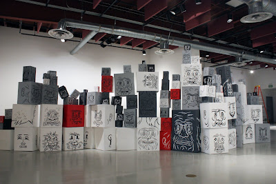
I found this installation very interesting. P.Williams created an exhibition, which I believe to be called 'Box Heads' or 'Art Scene' at the Huntington Beach Art Centre. It was an interactive exhibit where members of the public could move around the boxed and make their own installations. I think this is a really clever way to get people to be interested in your work. P.Williams also does illustrations of people and these images can be found in the sketchbook section of his website. I really like the way he illustrates people because they are mostly simple line drawing but they look so effective. Here are a few that I like:

People and Characters Research

This link shows some images that I have taken from tattoo books a few images from tattoos on people. These images influenced me a lot and I really like the styles and techniques that have been used. From these images I will take the most inspiration from the colours and colouring techniques used because I think that is what makes the image look effective.

Friday, 25 October 2013

Hannah Megee

http://www.hannahmegee.co.uk/
http://www.illustrationweb.com/artists/HannahMegee/view

Quick Links:
Portfolio
Books
Public Art
About
Contact

Hannah Megee is and illustrator and I chose to look at her because she creates characters. I like her style of drawing because she uses a lot of different lines to creates different tones and shapes.

These are some of her illustrations I like, I have chosen them because I like the techniques she uses to get certain tones and effects. I am highly influenced by her work. 

Katharine Asher

http://www.illustrationweb.com/artists/KatharineAsher/view
http://www.behance.net/katharineasher

Quick Links:
Character Design
Contact
Profile
Scrapbook

Katharine Asher is a freelance illustrator and I decided to look at her work because she creates character designs. I really like the techniques she uses because they are quite abstract.

These are some illustrations I like. I chose these because I like how abstract yet realistic they are. I think the colouring techniques she uses are really nice and they add a really nice effect to the image.

Nomi Chi

http://nomi-chi.com/home.html
http://nomicheese.tumblr.com/
http://god-of-insects.deviantart.com/

Quick Links:
Blog
Illustrations
Tattoo
Figures
Sketchbook

Nomi Chi is an illustrator from Canada and I decided to look at her work because she creates drawings similar to what I am taking part in for my People and Characters project. I really like her work I think it is very interesting and I like the media she uses.

These are some of her tattooed illustrations I like. I chose these because they are quite abstract which I really like. I like how she tattoos the same as she illustrates.